VGM Homelink
Reimagining healthcare enterprise software from the ground up
Reimagining a legacy system for a fast-growing company
VGM Homelink helps patients get the in-home medical services, equipment, and supplies they need at the best prices. They remove the hassle for patients by connecting insurance companies with providers. Over 500 employees rely on VGM's desktop software, VIPER, to serve their customers.

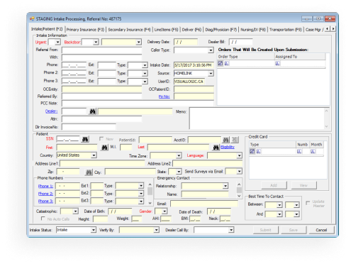
Before: VIPER 2 New Patient Referral Intake
When we began working with Homelink, VIPER was already 10 years old.
It was based on paper forms and built using outdated technology, with new functionality pieced together quickly to support the company’s fast growth. This resulted in confusing and complex information structures and workflows, taking up to six months for new employees to be comfortable using VIPER.
We set out to help imagine a system that would be easier to learn, more productive for its users, and connect employees to the whole lifecycle of a patient's order, rather than just their piece.
The Team, Timeline, & Scope
Our team completed this project over the span of 3.5 years.

Carolyn
Researcher

Andrew
Designer & Researcher

Ben
Designer & Researcher

Riley
Designer

Sarah
Designer

Matt
Front-End Developer
From conception...
Rather than moving VIPER to the web and updating its look, we completely redesigned the system to match the workflows and mental models of different employees and departments. We worked with VIPER users and management to bridge users' needs with business goals. Their development team ensured technical feasibility along the entire way.
...to implementation
Throughout the project, we worked with key stakeholders at VGM to develop a strategy that took initial design concepts all the way through implementation. We conducted usability testing in the developed staging system to work out any issues and ensure the system was usable for real employees as they rolled out the software.
...[VIPER], depending on its mood, can make completing your work difficult and long.
VGM Homelink Employee on what they liked least about VIPER 2
To fully understand employees, we stepped into their shoes...
We completed the new employee training course to understand how new users are introduced to the system. We conducted interviews and observations, watching users in real time and asking them about their workflows, successes, and struggles.

They asked the right questions to learn things about our business that even we didn’t know.
Mike Mallaro, CEO

Simplifying the complexity
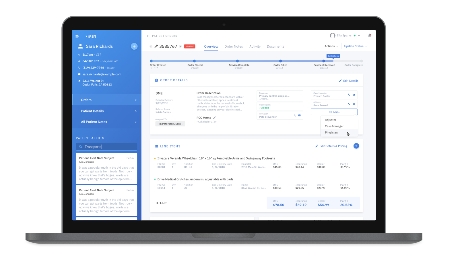
We established a design system for the new software and created rules for the information architecture and framework so that the software could scale. We accounted for better automation, streamlined and customizable workflows, and more visibility into how each employee's role fits into the whole lifecycle of an order to reduce training time significantly.
Workday beyond just software
We designed an entirely new interface—from new dashboards and work areas to more customizable launch points for users to start their work. Through improved copywriting, users felt more confident, made less mistakes, and understood what to do when receiving error messages. We considered how their whole ecosystem of technology could work with the software.

Visual Logic built a strategy to re-design VIPER for the web from the ground up. We modernized and reorganized information structures to accomodate a large array of services, enabling VGM to put patients at the center of the customer service experience and significantly reduce training times.
Defining UX practices & culture for a church management software company
Our work with PushpayOptimizing a legacy missile defense system for the modern warfighter
Our work with RaytheonRelationships don't start with a contract.
From general UX questions to project inquires,
let's start a conversation.