Making the world safer with human-centered design.
Visual Logic helped redesign a critical missile defense system used by the U.S. Government and it's allies.
keyboard_arrow_down
Imagine the weight you’d feel if it was your responsibility to stop the unthinkable: a missile attack.
These soldiers are charged with recognizing and shooting down incoming enemy aircraft and missiles. If they shoot down a friendly, it's a million (plus) dollar mistake and potential loss of life; but if they don't engage, they risk millions of lives.
Our client has built an engineering marvel— a global defense system that identifies, tracks, and intercepts missiles traveling 4000 meters per second. They’ve poured in 40 years of research, development, and intel to make this system what it is today.
Visual Logic was brought in to help facilitate a better understanding of the warfighters’ workflows, and in turn, create a more usable interface that would enhance performance in an increasingly crowded battlefield. The client knew it was time to put an emphasis on human-centered design (HCD)—or what the U.S. Army sometimes refers to as soldier centered design (SCD).
The system focused on three main areas:

Battle Management

Ecosystem Awareness

System Configuration
The client gave us the green light to focus on designing for soldiers—without considerable constraints— which meant we started at the most basic level: Is it useful? Is it usable? Is it desirable?
Take a Look
How Visual Logic Starts the UX Process
The system warfighters rely on to identify and neutralize threats wasn’t making the situation any easier.
In order to make a more user-friendly system, we had to learn about the domain, the product, and its users. We spent time with stakeholders discussing goals and constraints; time with subject matter experts learning about the military, its language, and its processes; and most importantly, we spent time observing and interviewing the people that will actually use the system—the warfighters—so that we could understand their expectations, needs and behaviors. Here’s what we discovered:
It was outdated and unrelatable.The system was unlike anything a young warfighter (18-30 years old) used in their daily life—it didn’t mimic the iPhone or follow Google Material guidelines or even look like something that had been touched since the ‘80s.
The learning curve was too steep.Because they had no reference for how to interact with the system, they had to memorize the relationships between thousands of settings. It took six months before a warfighter was operational.
The system offered no guidance.Warfighters had to navigate the system with little contextual guidance, which created a barrier to their ability to conceptually understand what the system was doing.
It was cluttered with unnecessary items.A decade ago the analog buttons were transferred onto the screen in the exact same format, which meant unnecessary information and controls were left exposed. This format slowed down the warfighter’s ability to find what they needed.
Think about this
for a minute:
have you ever noticed how the digital generation can breeze through Spotify or Apple Music with virtually no instruction? Can you imagine that same group trying to run a stereo from the ‘80s (preamp, amp, tape decks, CD, and a phono player) for the first time? Even the fifth time? The learning curve was significantly steeper and the product was considerably less intuitive. After the strides we’ve made in technology, it’s hard for a generation that has grown up on touch screen GUIs and advanced gaming consoles to convert its way of thinking to physical switches and dials designed with only functionality in mind.
What do warfighters expect from the software?
Critical information you need, when you need it.

With that data in mind, we worked with our client to create user journeys, and identify every step a warfighter must take to accomplish their goal. From there, we moved on to information architecture and a framework that addressed warfighters' situational demands—the “give me what I need, when I need it” expectation.
We put a priority on data visualization. Instead of forcing the warfighter to comb through columns and rows—to skim everything the system had to offer—we presented the data on an exception basis and used progressive disclosure. No more searching for a needle in a haystack. Visibility of system status is critical to a warfighter’s operational demands.
When we tested our initial designs with warfighters, it was clear our work would have an impact. Over the course of the project, we continued to iterate and refine our framework and designs.
“You’ve drastically increased our situational awareness.”
Take a Look
A modern, three-dimensional, intuitive interface, instead of black and white spaghetti.
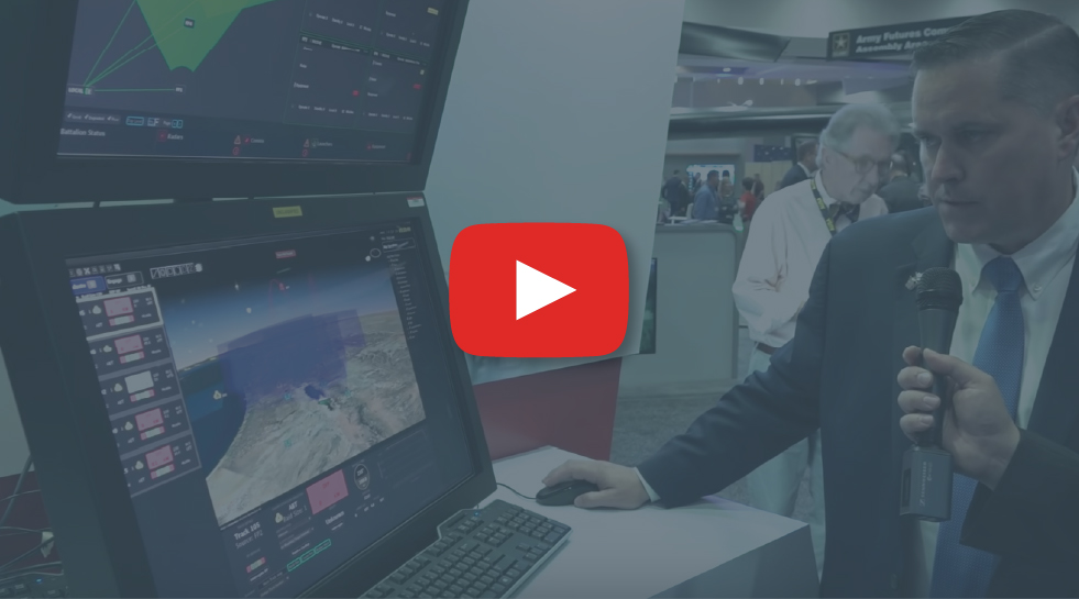
In this video, the host is demonstrating two interfaces; the original black and white screen was before Visual Logic was included in the design process.
We had months to improve the system. A warfighter has seconds to stop an attack.
We designed for today's users. By modernizing the interface and following conventional interactions, we were able to increase usability.
We only showed timely and relevant information. We reduced the clutter on the screen to only show anomalies—things that could be considered threats, rather than every bird in the sky.
We helped warfighters clearly understand their environment. No more black and white spaghetti. Warfighters needed a three-dimensional interface to help them see in time and space.
We reduced the learning curve. We organized the system into meaningful groups of data and used consistent language and visuals to reduce the need to commit so many things to memory.

We drastically increased the warfighters situational awareness

We significantly decreased their cognitive load
The results were clear: we had created a game changer
Usability testing is key to understanding if a product has achieved its goals. The feedback we received was overwhelmingly positive.

“During the tests, we were thrilled to see operators navigate the new WMI with little-to-no advanced training. The WMI displays complex information in an easy-to-understand way, helping Patriot operators make faster, better decisions that ultimately save lives”
Tom Laliberty, Vice President of Land Warfare & Air Defense at Raytheon Missiles & Defense
“You’ve reduced our training time from several months to several weeks.”
Beyond what we learned in the field, we used well-known heuristics to reduce training time.

We created clear visibility of system status
We matched the system to the real world
Instead of a screen full of outdated, analog-style buttons, we modeled current, real-world conventions.
We prioritized consistency and standards
In order to learn the system quickly, a warfighter has to trust that words, situations, and actions mean the same thing, no matter where they are in the system. We created a style guide to ensure future updates would maintain this consistency.
We designed to prevent errors
When dealing with life and death, there’s no room for error; we only presented them with usable data and disabled fields that weren’t applicable.
We focused on recognition rather than recall
We minimized warfighters’ cognitive load by making objects, actions, and options visible when they were needed.
“New people could figure this out pretty quick”
Help and documentation
We spent a significant amount of time focusing on help text—trying to teach warfighters as they interact with the system—in order to cut down on training time.
Every warfighter deserves the right tools to do their job. The defense of our country depends on them.
Are you ready to reduce training time and improve usability?
Connect with usEstablishing UX excellence in the defense and intelligence space
Our work with SRCUser-centered GUI for detecting plastic IEDs
Our work with NiitekRelationships don't start with a contract.
From general UX questions to project inquires,
let's start a conversation.