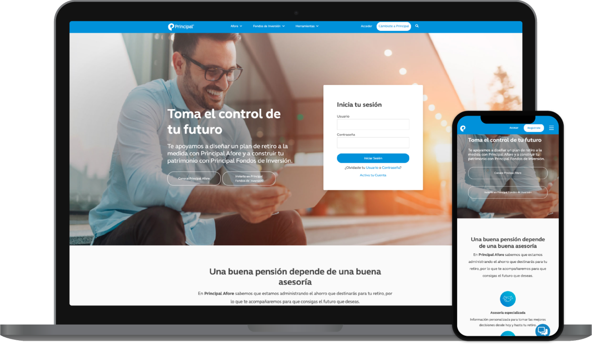
Principal Mexico
A one-stop-shop for financial literacy and action
Redirecting traffic
Principal Mexico's customers had a negative perception of saving for retirement- many customers relied on Principal representatives to make financial transactions on their behalf.
Principal wanted to direct more of this traffic to their digital platforms—but why were customers so hesitant to use them?

The Team, Timeline, & Scope
Our team completed this project over the span of 9 months.

Kayla
Project Manager

Riley
UX Designer

Andrew
UX Designer
Uncovering the root of the problem
In our discovery research we looked beyond Principal’s digital products and honed in on why customers had developed negative associations with retirement funding. We found the answers in public distrust surrounding saving money—Principal needed to establish trust with customers and provide financial education. These discoveries shaped the design foundation for the Principal product suite.

Aggressive and hands-off Investors alike
We created personas to represent Principal Mexico’s user base and spotlight the customer experience at all levels. Customer tiers were united by a cynical approach to money management. We identified how mistrust impacted each customer type to give Principal clarity on how their product suite could address these perceptions.
Navigating a complex industry with ease
When evaluating the customer portal, we found opportunity to improve access, organization, and management of information surrounding the Afore retirement plan. We created a comprehensive information structure for all of Principal's investment offerings, giving users better access to the information they need.

Communicating Trustworthiness
We focused on transparency, layman's language, and comprehendible visualization to promote a trustworthy feel.
Conversational copy made users feel like they were working alongside their Principal representatives. Performance graphics gave customers insight into their retirement progress, and benchmarking revealed how they were performing in relation to their peers.
We equipped Principal with a product that reflected an improved understanding of their customers’ perceptions and behavior.
The digital suite now eases hesitation in saving money by acting as a financial planner and educational resource, empowering customers to plan with their financial future in mind.
Aligning online grocery shopping with customer needs
Our work with Hy-VeeDesigning mission ready software
View our military workRelationships don't start with a contract.
From general UX questions to project inquires,
let's start a conversation.