The Industry
Retail & Grocery
Project Timeline
3 Months
Our services
Concept Design, UX design
Our Deliverables
Usability Testing, Journey Maps, Recommendations
Project Team

Kayla
UX Lead & Researcher

Kait
Visual Designer

Kurt
Strategist
Digital grocery shopping gives valuable time back.
Hy-Vee has been competing in this space since 2015, though needed to remain competitive as the demand increased.

The Problem
Hy-Vee’s digital grocery shopping tools, Aisles Online, had never been formally tested for usability.
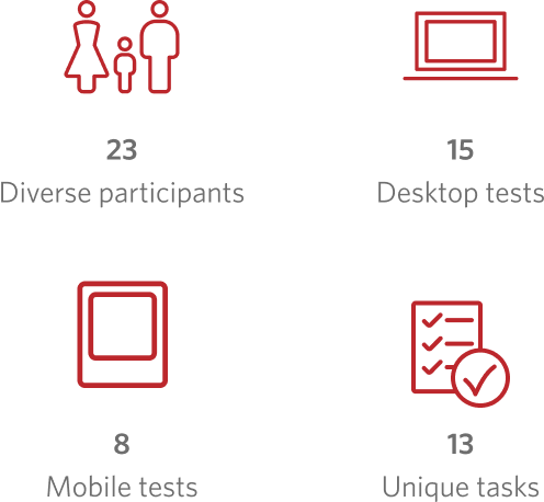
Our team evaluated Aisles Online with real Hy-Vee customers through usability testing.
Our Solution
Usability wasn’t the issue. We discovered something rooted deeper.
Overall, shoppers were able to complete their tasks. The problems we did see were rooted in unmet expectations and perceptions. To provide value, we:
- Documented three customer groups
- Outlined the complete user journey
- Provided 46 pages of invaluable insights


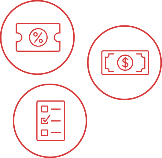
Three customer groups emerged from our research.
Aisles Online needed to accommodate a variety of shopping behaviors.
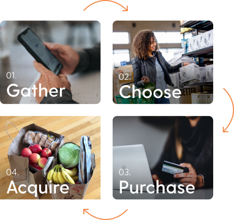
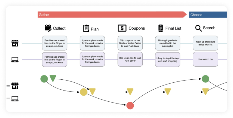
We outlined the user journey to highlight areas for improvement.
The user journey map highlighted thoughts, feelings, and obstacles during the stages of the grocery shopping experience:


We provided 46 pages of valuable insights from the voice of the customer. What’s next?
These recommendations guided the Hy-Vee Aisles Online team for moving forward—from search bar specifics to the entire digital ecosystem.
Hy-Vee is known for providing a helpful smile in every aisle, and we made sure they were prepared to implement that experience digitally.
Visual Logic has a way of stripping away all the visual noise and cutting experience down to something that is elegant and simple to use."
Relationships don't start with a contract.
From general UX questions to project inquires,
let's start a conversation.
