
GiveBox
Donate and manage smarter.

It starts with an idea…
UX takes care of the rest. Visual Logic is a UX design agency on a mission. We set out to improve the user experience of donating goods in our communities. We asked the question, how do people know where to take their items or which places need them most? GiveBox is a product design concept that makes intentional giving an easy, efficient, and delightful process.
Uncovering the right problems
Because user experience isn’t about the people designing the product, we did our homework to understand the major pain points through the entire donation process. We had our own ideas about the problems people face when trying to donate, but to our surprise, it wasn’t just the people donating that needed help.
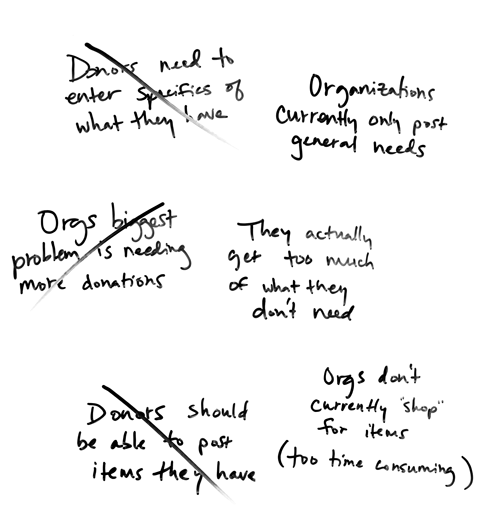
Organizations actually receive too much of what they don’t need, leaving their limited staff to sort through and figure out what to do with those items. This can be a time consuming task and could be avoided if donors knew the organizations’ needs in advance. Currently, organizations list only general needs, such as “clothes,” “toiletries,” or “canned goods.” If we could provide a way for charities to list specific needs, we could significantly increase efficiency and decrease headaches.
As for those donating, we discovered that most people aren’t aware of more than one or two places to take their items. And although they don’t want to add too much extra time, most would like to be sure their donations are useful.
"I found myself asking people if they knew where I could take specific items, and I knew there had to be a better way to donate - the idea for the app grew from there."

Who did we design for?
Our research allowed us to create fictional personas that represented both the coordinator of a local charity and different types of donors. These personas gave context to the solutions we would design down the road and acted as a communication tool.

Dawn Christensen
Charity Director
"I want to reduce my time spent sorting through items we can and cannot use, so I can focus on everything else going on around here and the people we’re serving."

Greg Hastings
Family Man
"I’d rather donate items to someone who needs them, but I need a quick and convenient way to find this information so I can spend more time with my family."

Carlie Hansen
Recent College Grad
"Right now I spend more of my time volunteering in the community, but I do have a few things around home I could donate. I just wouldn’t know where to start."
Designing a solution
We started to brainstorm possible solutions by asking questions. What would donors search for? Would that correlate with what organizations listed? How would these listings be best organized? What information about organizations is most important to donors?
To make sure our solutions would be useful to both donors and organizations, we cross-checked our ideas with the research we had done. For example, organizations don’t have the time to seek out items they need, so it doesn’t make sense for donors to post what they have. In addition, sometimes organizations will take second-hand goods, and other times they need unused products that can be picked up at the store, like toiletries or pet food. This means that we needed to design a way for donors to both search for what they already have as well as browse through other needs in the community.
Ultimately, the goals of both types of users were so different that we had to create two separate interfaces. Dawn can sign in as an organization and has an easy way to manage her wish list. Greg and Carlie can sign in as donors and find needs in their community with just a couple of taps.
"We needed to create an experience that would be beneficial to two types of users without sacrificing the goals of one another."
Two experiences, one app
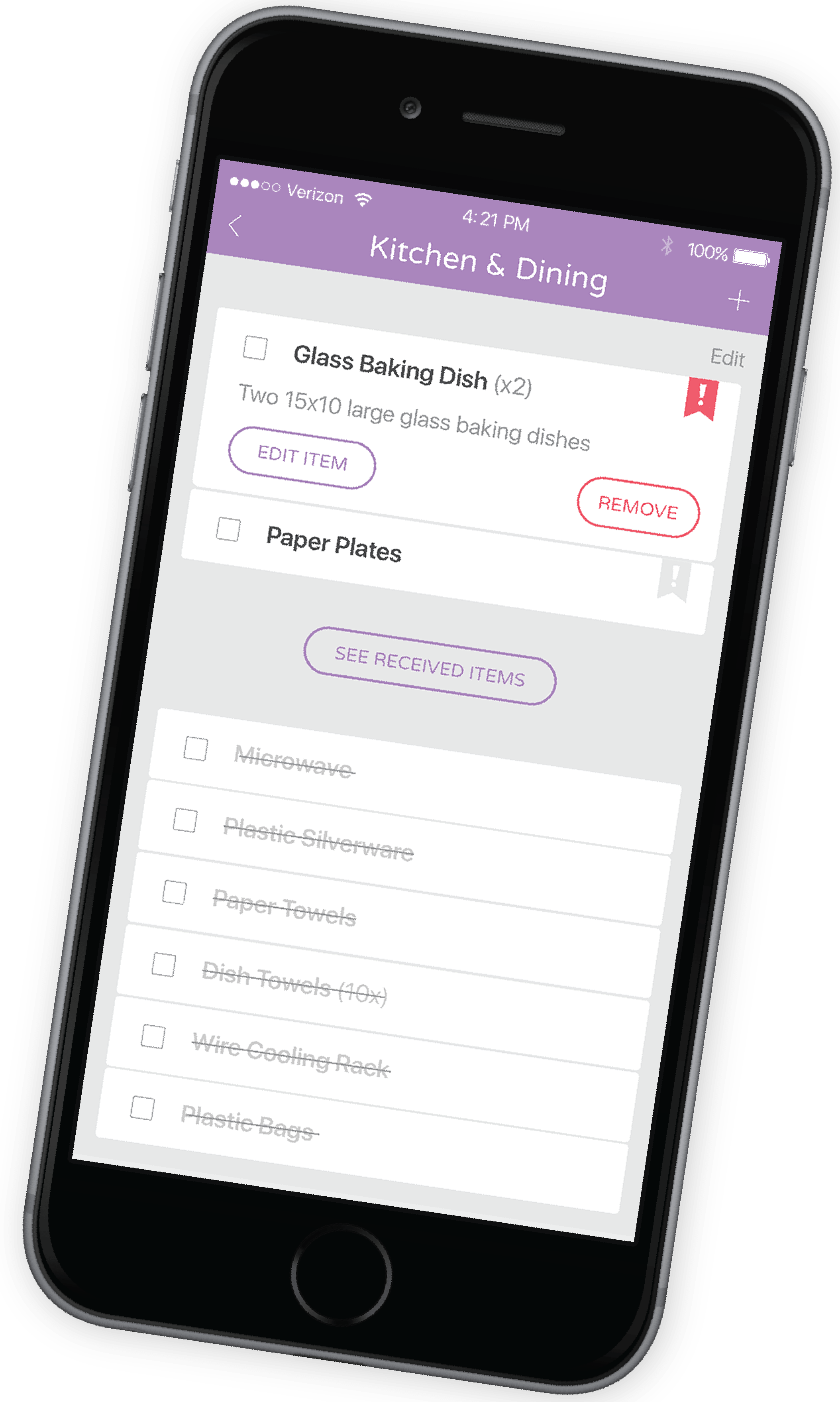
Our solution to an app that’s usable for both donors and organizations was to design two different interfaces. Dawn, an employee at a homeless shelter, uses GiveBox as an organization administrator to update her shelter’s profile and add items to its wish list. She simply types in the item name, selects a category, and enters a brief description about that item. These items are then searchable by anyone in the community with the GiveBox app.
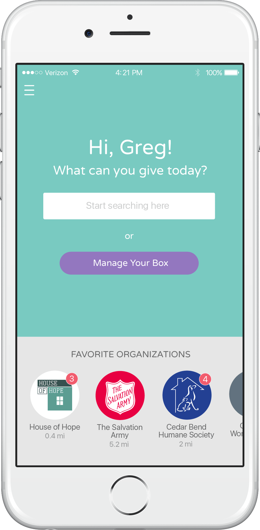
What can you give today?
Greg is finishing up his family’s annual spring cleaning and wants to find a place to donate some items they no longer need. Greg logs into GiveBox as a donor, and whether he is checking in on the newest items added to his favorite organizations’ wish lists or searching to see which of his items are needed in the community, Greg’s GiveBox dashboard acts as a launchpad so he can get started doing good right away.
Find the right place
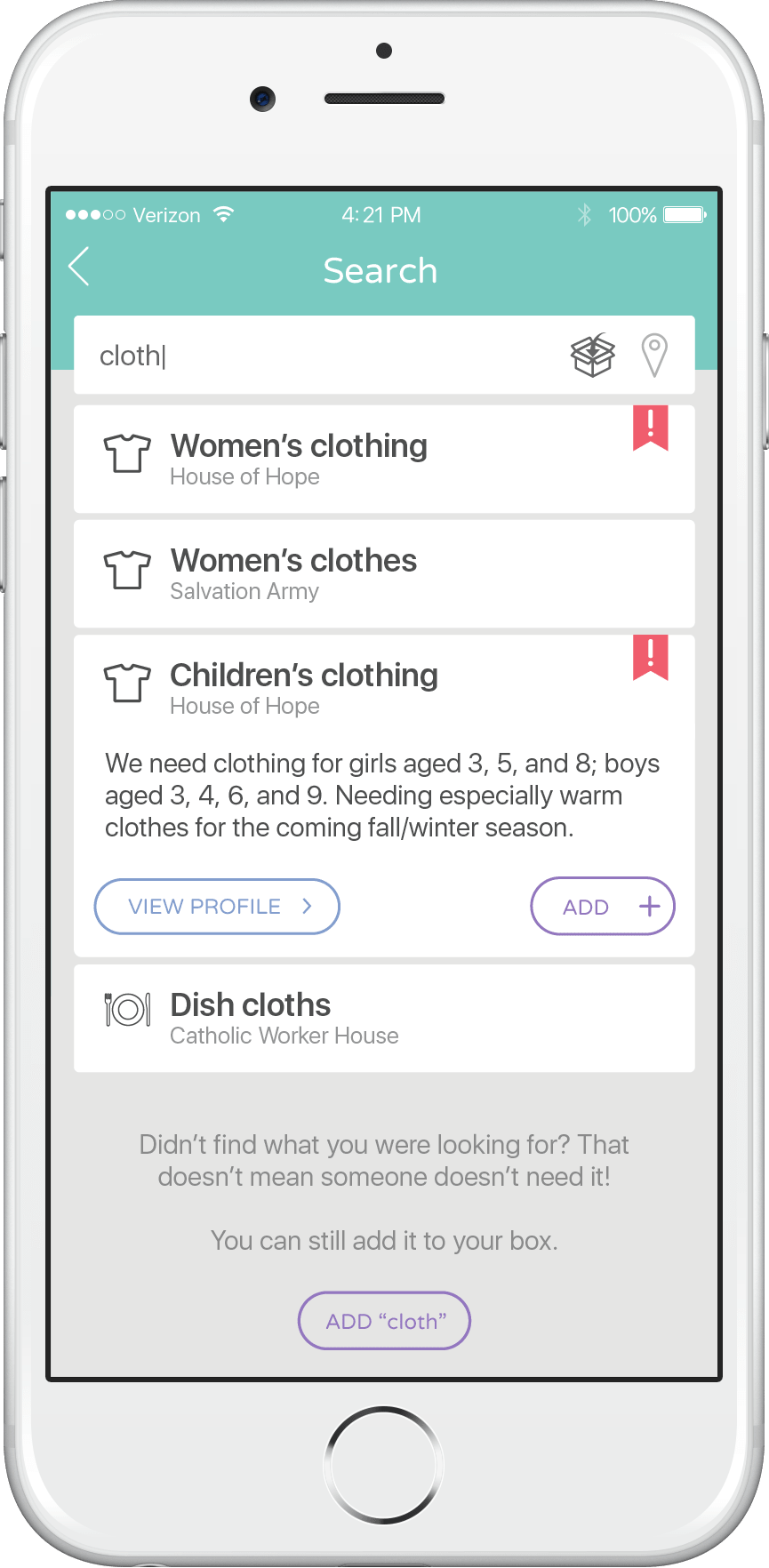
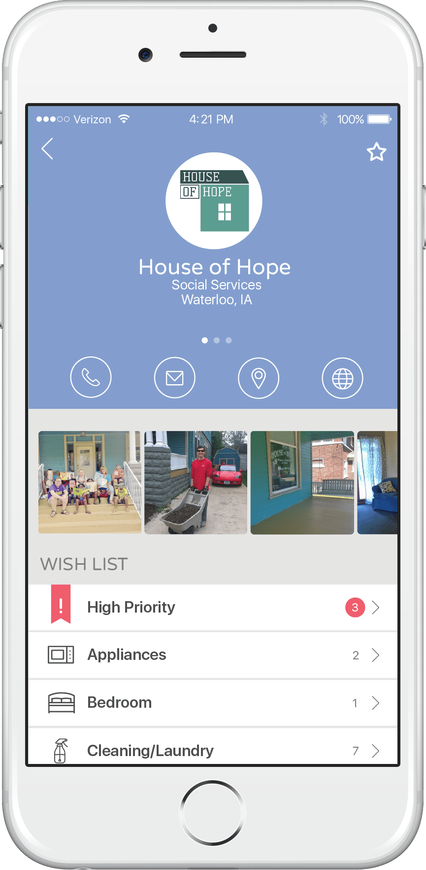
Through spring cleaning, Greg uncovers some of his children’s clothing that no longer fits. He decides to start searching in GiveBox to see if there is any need for that in the community. He sees that House of Hope, a local women’s shelter, has it listed as a high priority need. He selects this listing to see the full details and sees that his items fit the description of the sizes and types they need. Next, Greg adds the item to his Box, a feature that allows him to organize his donations. At the same time, he places the items in a box at home and labels it “House of Hope.”
Engage with organizations
Before it’s time to drop off his items, Greg decides to check out House of Hope’s profile. From their profile, he can see more about their mission, contact information, and of course view their complete wish list. This is a way for him to get a quick glimpse of what the organization does and how to get ahold of them. From here he can also get driving directions to their organization for when it comes time to donate.
Organize and drop off
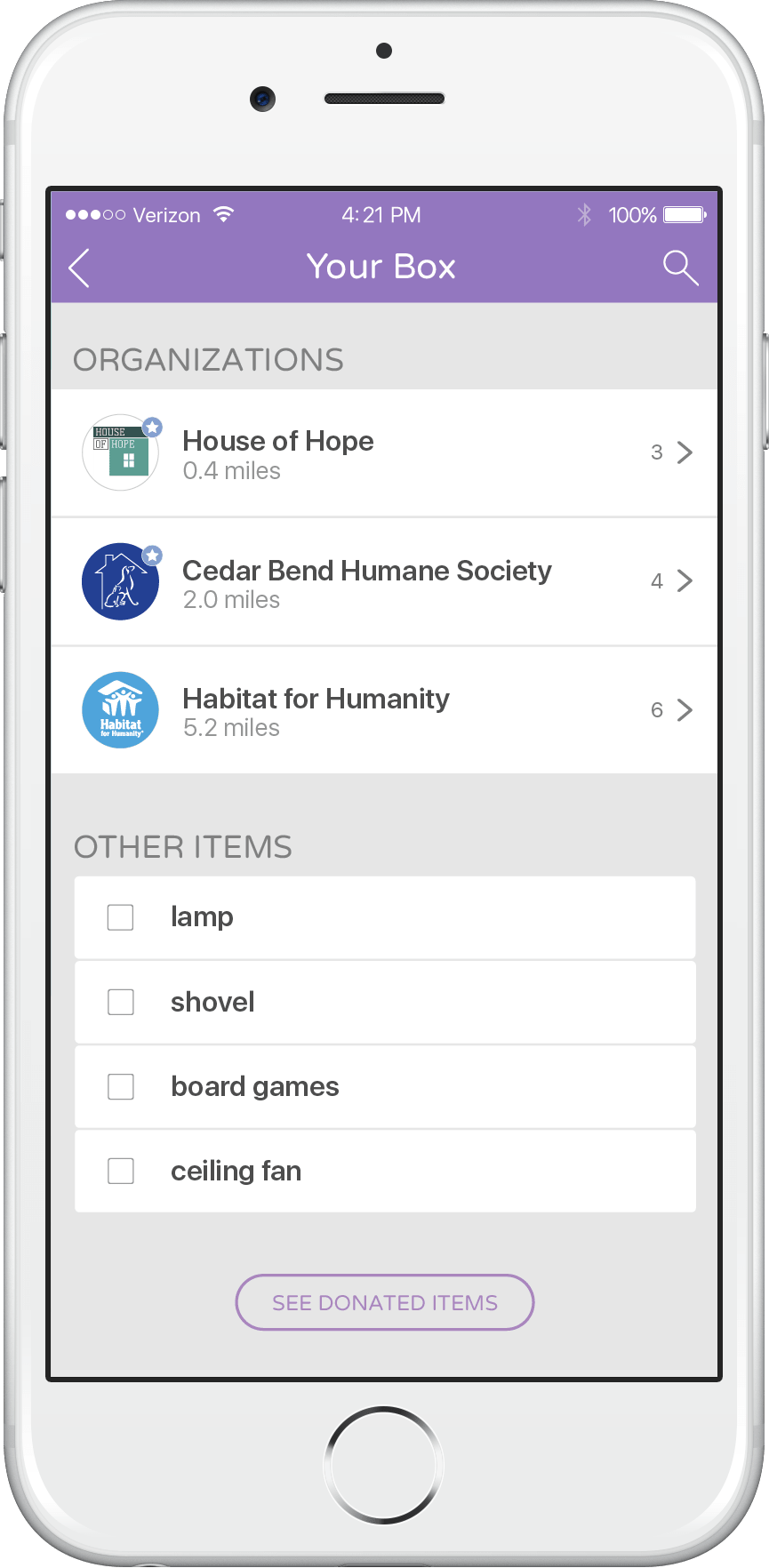
All of the items Greg saved when he was searching are stored in his Box. They are automatically sorted by the organization that needs them, so he can remember where they go as he gets ready to drop them off. House of Hope is located near his workplace, so he plans to stop there on his way home tomorrow, and he’ll drop off at the others over the weekend. Because his Box is organized for him, the extra effort to go to multiple places doesn’t take as much time, so he can still spend time with his family. When he’s finished donating, he checks off the items, which are then archived for his records.
GiveBox helps
Through user testing, we found that GiveBox would be useful to both organizations and those donating to them. Organizations now have an easy way to manage their wish lists and get the word out about their needs. In addition, members of the community, like Greg, can discover new places to donate the things they no longer need.

“We depend on community generosity to care for hundreds of homeless animals every year, and GiveBox makes it easy to navigate, post, and share the items we need.”
Amy B. Anderson
Marketing & Events Coordinator
Cedar Bend Humane Society
Explore more of our work.
Saving lives with good design
Removing complexity from the user interface to ensure soldiers can quickly assess and react to threats.
View Case Study
Bringing augmented reality
to precision agriculture
Empowering farmers to directionally locate fields and telematically-connected machines using augmented reality.
View DetailsRelationships don't start with a contract.
From general UX questions to project inquires,
let's start a conversation.
Three ways to improve your customer's experience.
Project-Based UX
Is your system not performing as you hoped, or are you ready to upgrade an outdated experience? We can help you beat the competition by using our proven, scientific method to gain you more customer love.
Build it RightUX Workshops
Are you a DIY-er looking to bring UX training to your company? We'll guide your team through an immersive workshop about all things UX, or if you’d rather hone in on a particular skill, we can do that too.
Build UX KnowledgeTransform your Company
Do you want to transform how your company approaches building products? We'll guide you through the process of integrating human-centered design methods into your organization.
Build a UX Team
