The Industry
Machinery
Project Timeline
5 Months
Our services
Concept design
Our Deliverables
Reasearch, Personas, Journey Maps, Wireframes
Project Team

Kait
UX Researcher & Designer

Matt
UX Researcher & Designer

Techmates Group
Consulting Partner
Bobcat built a business by breaking down barriers.
Hundreds of machines and equipment are seen, sold, or serviced at Bobcat dealerships everyday.
The Problem
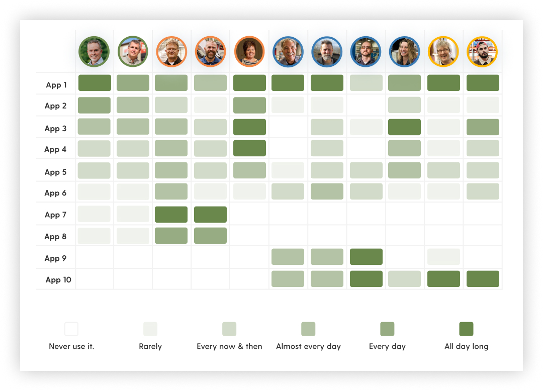
But too much information across too many applications created new obstacles.
After interviewing over 20 dealers, we uncovered three key problems in their internal applications and workflows.
Disjointed experience.
A lack of integration across apps used to accomplish various jobs created a segmented experience.
Minimal recognition.
Users were required to remember work-arounds in order to retrieve key information.
Inconsistent conventions.
Many apps followed the Bobcat brand, but few followed the same UI interactions and conventions
Our Solution
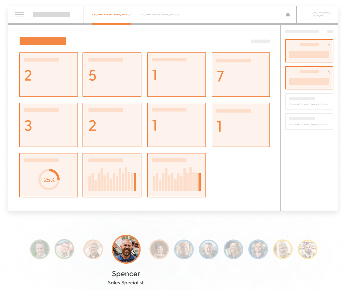
The right information within one unified platform.
We recognized the pain points dealers were experiencing as they dug through too many apps, so we conceptualized a Bobcat Dealer Portal that gave them what they needed by:
- Designing a default set of dashboard widgets tailored to each user’s role
- Making users aware of what was most important for easy action
- Allowing users to prioritize and customize widgets to fit their own workflows
- Grouping all apps under one unified menu for simpler navigation
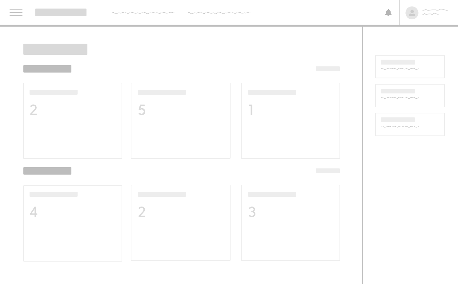
We gave users awareness of what was most important and their own ability to prioritize.
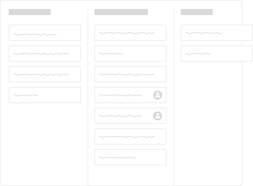
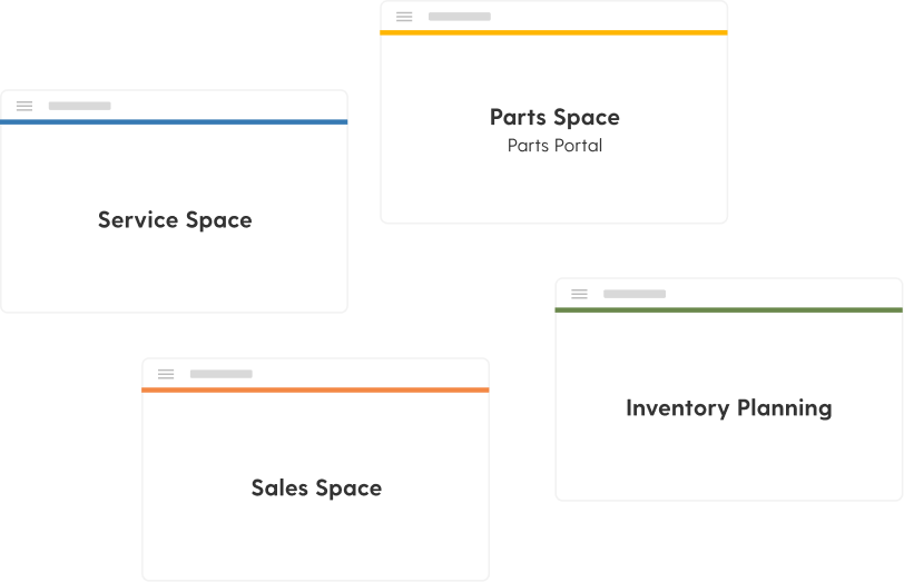
We grouped core apps and department-focused apps.
We started at personas but uncovered opportunities for innovation.
“Our initial task was to create personas and journey maps for this particular project, and we agreed they were needed given the unique problem space of large and small dealerships having varied yet similar needs. What was great about this client is that they trusted us to take the appropriate steps through our human-centered process, which led us to identify greater opportunities
for innovation we didn’t initially foresee. We had the chance to create design concepts to give stakeholders a vision of the future state of their product and demonstrate how to utilize the new personas to help guide product strategy. After giving our findings to them, we coached Bobcat stakeholders how they could inform product decisions moving forward.”
Relationships don't start with a contract.
From general UX questions to project inquires,
let's start a conversation.

