Episode Summary

Our team breaks down the timeline of a user experience design process. Visual Logic partner Andy Van Fleet and Directors of UX Design, Kayla Byington and Nick Bray answer questions like: How long does UX take? And What does the process of integrating UX realistically look like?

Transcript

Andy: Today, we’re talking about demystifying, the UX timeline, and I’m joined by Nick Bray and Kayla Byington. And I wanna welcome you both. With that, introduce yourselves and just talk at a high level, some of the projects that you’re maybe currently working on or that you’ve worked on in the past. And then we’ll jump into the topic of how long does UX take?

Nick Bray: As Andy mentioned, I’m Nick. In my career here at Visual Logic, I think I’ve spent a majority of it. Or I’d say actually about half of it in the agricultural field. So spent a lot of time working with growers, agronomist, and the combination of those two, to build software products around farm management. And then, lately I’ve been working a lot on the DOD side of things. So some project work, but kind of a unique opportunity to help organizations build UX teams internally. And so just thinking about what that looks like foundationally, and how the processes integrate into kind of what they’re doing today or what they have been doing and making that as hopefully seamless as possible.

Kayla Byington: So I spent a lot of time working with Nick on the agriculture projects, learned way more about farming than I ever wanted to. But lately I’ve been doing a lot of work in the healthcare industry and trying to make products easier for pharmacists and doctors. And those projects have been on shorter timelines less hours. So lower budget options for us to try to figure out how to make it work.

Andy: Yeah. So I was thinking about this collectively, we have over 50 years of UX experience. And so I’m excited to talk with you both just about what we’ve seen from the UX timeline standpoint. And we’ve seen a lot. I mean, there’s been a lot of different types of clients that we’ve worked with a lot of different budgets, a lot of different project outcomes and deliverables and things like that. So I think between the two perspectives, we’ll have the basis covered in terms. What could you accomplish for a short amount of time and what can you expect there to be risks in the short time frames? And then Nick, you could have endless times on some of these budgets and what risks does that come with as well. So I think I’ll just open with the question of like how long does UX take what’s the timeline that somebody could expect for user experience to take. And I know that the answer is, you know, design is never done. Right? I mean, I think that’s one of the things that will come out of this too, is that it’s not just an activity that make this look good and then we’ll go away.

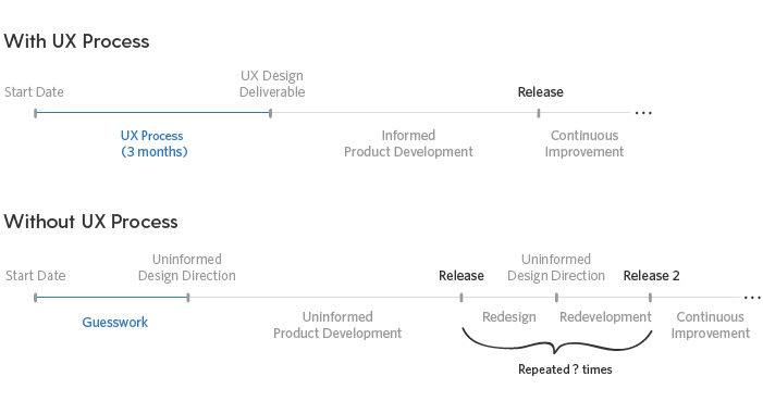
Nick Bray: my short answer is. Normally, we need a lot of time up front to understand the problem with a lot of the work that we’re doing. While we might have certain release dates and milestones that we have to hit a lot of the UX work needs to happen front. When I think about the UX timeline, to your point, I think it’s ongoing, right? There’s we’re always gonna be doing something continuous improvements to try to enhance the product or project or service or whatever it might be. But thinking about the brunt of understanding that goes in up front is hard to measure. There’s certainly a lot of factors. What’s the overall risk of not being able to deliver a usable system. So that would be something that we’d want to consider up front. And we would also wanna know the complexity of the overall project. Like how big is this within that user’s life? Is it the only thing they’re working with, if it’s a work product or is there other things that are needing to integrate that with? So those would be the two main factors I would think through. That you need to consider before saying, this is how long we think it’s gonna take to truly understand the problem and be able to deliver something that meets the criteria of usable based on that user type.

Andy: The types of work that we’re currently doing is in really deep, complex domains. And so I think as you’re talking through this, the understanding part of it is something that we have to get right. We have to understand the complexities of the domain, the business stakeholders goals, what the end users goals are.

Kayla Byington: Yeah, I think understanding is probably 50% and design is 30% and then testing is 20%. And so often we’re brought in at the design phase and they don’t realize, our clients don’t realize that understanding is such a huge portion of the design. And we can’t get the design right if we don’t actually deeply understand the domain and what we’re doing. The project I’m on now. I feel like I’m going so fast and it’s all so focused on design and then subject matter expert opinion that I’ve painted myself into a corner a few times, or I’ve hit a dead end and it’s like, well, I gotta walk it back because this isn’t right for this portion of the product over here or this interaction here now doesn’t make sense because I know something new that I didn’t know three days ago when I was doing it. That adds to the timeline. So if we, instead, can understand more upfront, it will be more efficient.

Andy: Yeah. Yeah, exactly. And sometimes there’s these arbitrary timeframes that are being put out by executives or leaders to say, look, I’ve gotta get this done with this number of hours by this timeframe. The project that we worked on about three years ago, where we had an executive who, you know, and this is not age biased, but he was in his sixties. And he was just saying, "I am used to getting things done in a certain timeline. And I want this to be done in six months."

Nick, you leaned forward in the board room when he said that and said, you want it done at the end of this year. And the consensus from the entire group afterwards was, this is gonna take three years.

Well, we knew that. And I think a lot of that was coming to like, we don’t know what we need to build yet. We need to understand. And, Nick, it was around I think month nine into that project that we started to do the design work that then took another nine months to get done that then validated it. And so it ended up taking about three years total. What are the risks of that type of mentality and what are they going to miss?

Kayla Byington: Yeah. We talk a lot about, if it’s acceptable for the brand to rush something out. So you put a six month timeline on there and it’s a project that really should take a year and you put something out six months that fails to work. You’ve now just tarnished a reputation that didn’t need to be right. There was no rush. The project I’m on now it’s more about the competition. They’re trying to beat the competition out there, but we’re talking about a product for pharmacist. you don’t wanna mess that up. Right. It’s kind of serious.

Andy: It’s a big deal to get that right.

Kayla Byington: And so there is a risk to the user. There’s a risk to the patient. It is just hard to say that we know enough to go out and get it right just for the sake of beating the competition, when you’re dealing with a risky product like that.

Nick Bray: Part of our responsibility is to identify those exact risks and for every situation it’ll be slightly different. Like, well if we do this too fast what are the negative outcomes that could come? And the one that you were just mentioning, Andy, I think in shortening it to six months. Well, first of all, it wasn’t even gonna be possible to get enough code written to deploy in that amount of time. But even from a design perspective, the entire goal of that was to increase internal efficiency and actually there’s gonna be some cost savings with that, of course. But they were using a legacy system. And even if that legacy system was tough to train on, it was fragmented in the way that it was constructed and not intuitive, based on the testing that we did. Once you worked on it long enough, there was muscle memory. So there was some built in efficiency. And so if you didn’t do enough, work up front to really understand the problems and solve their workflow. You’re gonna end up actually walking backwards on efficiency pretty clearly. I think that was the case we were making. And because in six months we wouldn’t have even actually been able to deliver a full functioning piece of software. It would’ve become more fragmented. We would’ve only delivered part of that. So they’d be using the legacy system on one side and some modern stuff over here as we continue to develop that out.

So that, that was one clear risk is that we were actually gonna lose efficiency for a long period of time, you know, three years.

Andy: If I’m a business leader and I’m thinking, okay, I’m gonna dedicate this amount of budget and nine months to a UX team. What types of activities could you expect a UX team to get done in a nine month period? Based on an average size project and let’s just say it’s an internal piece of software like we’ve just been talking about.

Nick Bray: I mean, you could do a lot of the artifacts that we produce around research. And I think that just really depends, would you wanna go really deep and understand it, but still only release like an MVP, something that we know it needs to a lot more function, but we’re not gonna release it all. Or are you thinking we deliver the whole thing because you know, if you wanted to deliver all the user needs that you think the research is driving you towards. You might have a mediocre experience in nine months. Right. But if you focused on deeply understanding who our users were, knowing that we weren’t gonna give them everything up front, you’d really build a nice backlog, not only of user understanding to make design decisions off of them, but then certainly some work out in the future as well.

Andy: So maybe break it up into three month increments in that nine months. What would that look like?

Nick Bray: I would say three to four of that would certainly be figuring out what it is we need to do. Hopefully you know, two to three months of actually producing, iterating, testing, concept validating. And then towards the end, the last few months are really refining and getting close to deployment of that. Let’s say there’s a product that exists where we’re talking like a legacy product and we’re going to make that anew again. And so we do know some things about how the users are working. We know, we think we know what their goals are.

We might have some of that stuff given to us. But there’s still a lot of foundational questions that need to be asked, which is, well, why is that the way that they’re doing things? Is that just a again, kind of the arbitrary point. Is that a business decision that was made? What are the metrics that we’re driving that decision?

If we’re gonna redo the software, is this an opportunity to redo the way the business thinks about that process? So UX design or human-centered design doesn’t necessarily start and stop with the screen and the software that they’re looking at or the hardware product, whatever it might be. But it really steps backwards into what business decisions led us to even be here in the first place. And is this an opportunity to change some of those business decisions? How we operate operational questions, before we redo the software because, if you want us to redo the software and the way you operate now. You’ll get some usability probably out of that, we’ll make some improvements, but if you’re not willing to change the process, we can only go so far.

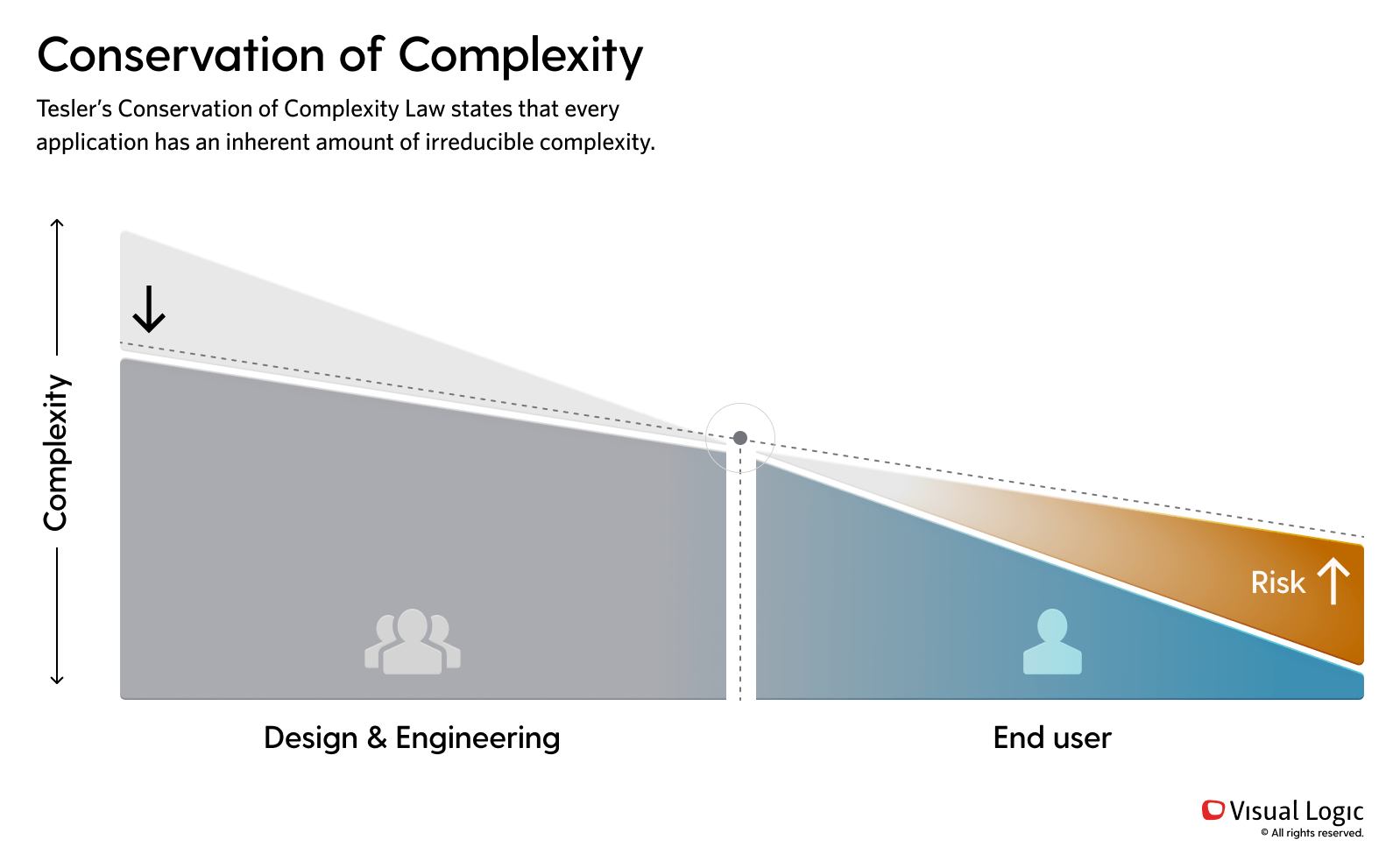
Andy: That focus on the understanding part of this really starts to engineer out the complexity of these systems. And if you don’t engineer out the complexity, you’re not afforded a budget to be able to do that. You’re really doing some maximum window dressing. I hate to say it. And that’s not necessarily where a client wants to spend their money because it’s not very effective. I mean, yes, it may look better and it may perform better in usability tests and things like that but not deep down. Some of these stakeholder facilitated meetings took a long time. I mean, for instance, there was one client that had a pricing tool that had we just gone straight into design and tried to design something. It would’ve been highly ineffective as this piece of software is used by 400 people. But to just redesign for window dressing sake, would’ve completely missed the point. So I think we spent four to six weeks with the stakeholders to understand the pricing process. And then redesigning, when I say redesigning is really information architecture and really understanding the complexities of it. And then starting to design for maximum efficiency. That took a long time. It took longer than we expected. If we had seen that as a bullet point, redesign the pricing tool on like a RFP or whatever, probably would’ve said, I don’t know, maybe that takes a day or two just to redesign the window dressing of it. But to go back and understand the complexity of it and then ask the question. You want us to redesign the business process of this. That’s gonna take a long time. That’s gonna take four to six weeks for us to meet with the stakeholders, to understand what the problem is, and then to reimagine a better flow and then a better design on top of that. I think that was surprising to their team, but it really maximized their efficiency. And I know that to be true because it would take them six to nine months to feel comfortable on that system after they had been trained on it. But they felt inadequate as employees because it was very convoluted and cumbersome. After we redesigned it, we heard things from them. Like, you know, it’s gonna take us a couple weeks to understand the system, and then we’re ready for the floor.

Kayla Byington: Well, and so often with those old systems, you’re like, well, why is this here? Or what was the purpose of this? And people can’t even answer it. They’re like, I don’t know. Somebody somewhere thought we needed it. There’s nothing behind so many of those choices that the system can become convoluted so quickly. If it’s a product that exists, it’s really ideal to sit down with a user and watch them try to use that particular product and find like, what workarounds are they using? And tell me what you think that button does and how does this process work?

Because you can uncover a lot that way.

Nick Bray: You know, that understanding part, is gonna be measured in months. And I think, the magnitude of change as we’re in the early phase of that is gonna be a lot. Right. So we’re gonna uncover things and have to go back and rethink our structures. But anywhere between two to four months in, we should have a really good understanding. We should have concepts. We should have, our information architectures. We should have frameworks for how we think the information needs to be stored and I guess displayed. So those types of things can all be validated, right? So I guess the big milestone to me is your understanding is the first thing you wanna be doing. And this is iterative, right? It is validating, is our understanding of what we’re hearing through all these stakeholder conversations, user interviews, is it correct? You guys know me well, I’m always on top of the fence in my decision making. So getting me to be comfortable with putting a stake in the sand and saying, Hey, this is what we’re gonna go forward with is always tough, but I do..

Andy: Always evaluating your trade offs.

Nick Bray: You’re always evaluating trade offs. And I think there is a point where you do need to just, continuously understand, but now we’re transitioning and everything else we validate and now is gonna be done through actually designing what we think is right. And bringing that out. And that’s where it gets a little more iterative, maybe a little more agile. All that iteration is great and that’s really important to the process. But there’s also, that kind of feels a little bit more waterfall esk, which is that understanding we have to get that done first and we can learn why we’re iterating, but there’s some things that need to be known up front. Exactly what we’re talking about with stakeholders. And are we changing business processes? And if so, why? And this is something I don’t love doing, but like, If they have requirements for legacy software, are we doing an audit on all that? Like who wrote that requirement? Was it 20 years ago? Are they still at the company? Can we talk to them about why it exists? Nobody seems to use it, right. And can that be scrapped?

Andy: You both have touched on this, which is when you go from understanding to design, that’s a big moment for a UX team to make that transition from okay we have gathered enough information. We believe it. We’ve validated what we’ve heard from multiple sources. I’m gonna take this information and do some design activity with that. Before we wrap up, maybe we could just talk about in general terms, the conservation of complexity. I think what we’ve talked about, around like the UX timeline really ties back into that mental model that we have of the conservation of complexity, which is really, there’s two sides of this equation. On one side is this end user who really wants the optimal user experience. And on the other side of the equation is the product design team. Who’s responsible for engineering off the complexity. So everything we’ve talked about so far falls in that side, which is the understanding, the design, the validation, and then handing over to the end user a highly usable software application or some sort of end product that they find highly usable. And there’s levers in there. Like the product team can’t work infinitely on from a time and budget standpoint to get that right. But they do need to be allotted the right amount of time to engineer out that complexity.

Otherwise, the end user quote unquote has to figure it out or they’ll be trained through it. I guess in closing some tips or some thoughts that you have around. The benefits and the risks of this mental model of the conservation of complexity and what should business leaders be thinking about as relates to demystifying the UX timeline.

Kayla Byington: So in the beginning we talked about how there’s too little and there can be too much. And I think on the too much side, you get into this almost paralysis of, we have to test it, we have to test it. We have to test it. And it’s like, well, you don’t have to test the yes or no question. You know, not everything needs to be tested, but there is a line somewhere where you have to get, at least to that line of saying we know enough about enough. That we’re comfortable moving forward. And that line is I feel like it’s kind of an art. When we’re deep in a project, we know the line, but it’s not something we can just come in and say, at this point on this date, after we’ve done these things.

Andy: Right

Kayla Byington: We will know.

Andy: Right. Because we don’t know what we don’t know.

Kayla Byington: And that is what is so hard about the UX timeline. Or you get hit, like you just get T-boned with something you’re like, oh my gosh, that is gonna blow this whole thing up.

You know and those conversations are so hard to have. because you know, everybody has a budget. Everybody has a timeline. Everybody has a responsibility. And I’ve had my fair share of those. Ugh, but you have to do it. You have to be upfront. You have to be honest. Otherwise you’re never gonna get to the other side of the teeter-totter where it’s more user friendly. You’re just not gonna make it there if you don’t have those hard conversations.

Andy: When you do get t-boned or blindsided by something that’s new information that changes everything that conversation needs to be had. So that way the integrity of the work that’s been done so far is maintained. Yeah. If you gloss over it, it’s gonna really jeopardize the end product.

Nick Bray: Yeah. Yeah. I think the UX timeline really depends on when a business can actually measure how much risk they’re willing to put on the user and what happens if things go wrong, while they’re using your product. If they’re able to measure that, we can help guide them through how much human-centered design work needs to go into this for it to be successful. I think we tend to lean on the side of, we want very minimal risk on the end user. Right. and maybe not to the point of this utopia land, where it’s the best perfect experience ever. We know that there’s business constraints and they’re gonna come at it from cost savings standpoint. Right. So I think working with any stakeholders to say, here’s the things you should care about measuring in terms of user risk and quantify that, and then start being able to set our usability benchmarks according to that. So the UX timeline to me kind of depends on that. Well, have we achieved the agreed upon benchmark that mitigates the risk we’ve talked about to that user. And if we haven’t yet, then that’s another couple percent onto the overall timeline. We have to go back and redo some things. So I think it’s a variable, but, in order to calculate it effectively, we have to understand those risks and what we’re willing to take in terms of building a usable or not usable product.

Andy: That’s great. That’s a great place for us to cut this off for today’s episode. There’s a lot to unpack there. Thank you both for your wisdom and your expertise and user experience in helping to demystify the UX timeline.

Nick Bray: Yeah. Thank you. It was fun.