UX Tip: Improve Your Mobile Forms with Input Types
2 min read
If you really want to create a good user experience, you need to pay attention to the small things. Those small details can really add up and set you apart from your competition. Your users notice and appreciate it when you demonstrate that you are looking out for them!
Let’s look at a simple and practical example that you can use today.
Make your web forms easier for mobile users.
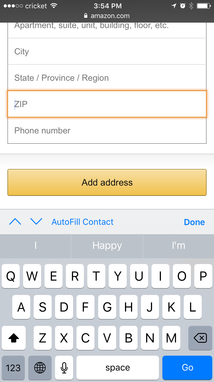
Have you ever tried to fill out a form on your smartphone? Let’s say you were asked to enter a phone number or zip code. When you tap into the text field you see this:
 Many websites and applications forget to set the correct keyboard
Did you notice that the form is asking for numbers, but the keyboard isn’t displaying them? You might be thinking that it’s not that big of a deal, the user just has to tap on the “123” button to switch to the numbers…but this is where you can surprise your users and save them an extra tap!
Wouldn’t it be better if we could show them this instead?
Since we know that we need numbers, let's give them the right keyboard and save a tap!
Here’s how you do it.
Numbers
If we forget to set the input type, this is what the code looks like:
<input name="zipcode" id="zipcode">It only takes a small amount of code to show the number keyboard:
<input name="zipcode" id="zipcode" type="number" pattern="[0-9]*">Telephone Numbers
Technically, you could use the input type of “number” for a telephone number, but there is a special input type of “tel” meant just for phone numbers. This will also display the number keyboard.
<input name="telephone" id="telephone" type="tel">Add it to the backlog!
I realize you might not be a developer, but I only showed you the code so that you would understand how simple this is to implement. If you have number fields in your app, make sure that you’re showing your users the right keyboard!


