The Uncanny Valley
2 min read
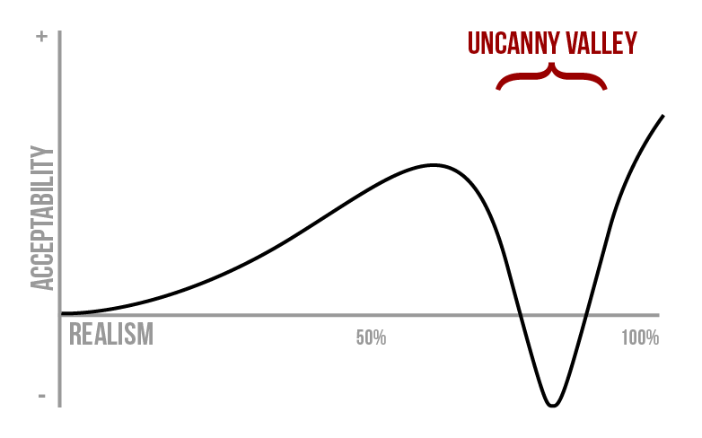
The Uncanny Valley is the idea that there’s a curve related to an object’s level of realism and how acceptable we perceive it to be. If something is somewhat realistic but stylized (like a stuffed animal), we’re going to like it. The more realistic it is, the more we like it—to a certain point. A cute doll or human-like robot might bring us joy. However, once we cross a critical point in realism, our opinion of it plummets into the valley. Think about “realistic” video games or animated movies (Polar Express, perhaps) where the characters just feel… off. It’s possible to get out of that valley, but only if the realism is cranked up enough to be truly indistinguishable from reality.

What I particularly enjoy about this curve is that it can be applied to more than robotics or animation. For example, it can relate to the level of detail in a piece of art: the more detail you add, the better it looks—to a point. Excess detail sends you plummeting into the valley with your only escape being to add enough to make it nearly indistinguishable from real life.
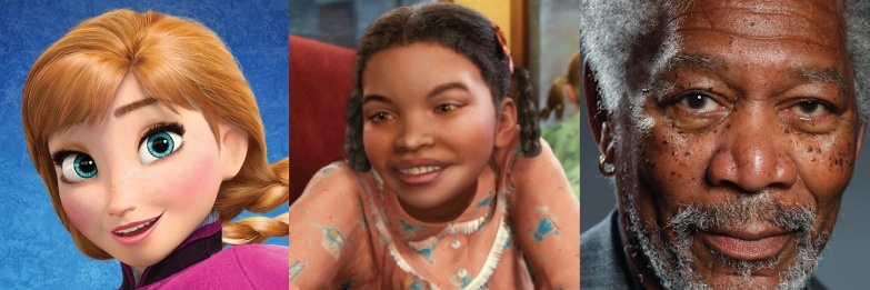
For example, which of the images below seems off, or “uncanny”? The animated and slightly cartoonish Anna from Frozen, the realistic girl from Polar Express, or the hyperrealistic painting of Morgan Freeman?

Similarly, the uncanny curve can apply to user interface design. Skeuomorphism can be an effective tool for adding familiarity or hints of function: lighting can hint to the pressability, texture can hint to similarly-operated real life objects, or sounds can remind us of analog predecessors. But, add too much detail, and you plummet into the realm of discomfort. A visually-detailed calendar that looks just like paper but scrolls like a web page feels off. It may be possible to push past the valley with hyper-realism; however that’s both more time-intensive and limiting.

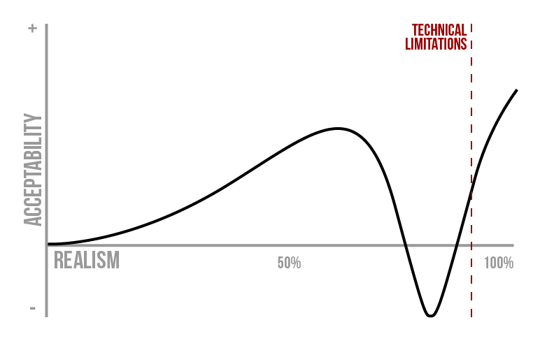
In addition, striving to achieve parity with real-life objects will always be difficult: there’s only so much you can do with a mouse or touch and a two-dimensional display. These limitations effectively cap our horizontal “realism” axis. To keep the user’s level of acceptability or enjoyment high, we must choose an appropriate level of realism. This may be part of the recent trend away from skeuomorphism and toward flatter, simpler interfaces.
In the end, the Uncanny Valley is an interesting concept to keep in mind when modeling and designing. Its curve can be applied in several ways, from animated graphics to art, user interfaces, and beyond. Remember this the next time something semi-realistic just seems off. Pull it back or push it forward out of the Uncanny Valley.


