Responsible Innovation: Safety in Product Design
4 min read
As UX designers, it’s part of our job to make sure that the experiences we create are safe for people to use. Each day, we encounter experiences that have been designed for our safety. Whether it be airbags and seat belts in your car, traffic lights and signs on the road, airport security, chip-embedded credit cards, or the fingerprint reader on your phone, safety and security are at the top of many experience designers’ priorities. Some of these experiences are already done extremely well, but there are some that are not.
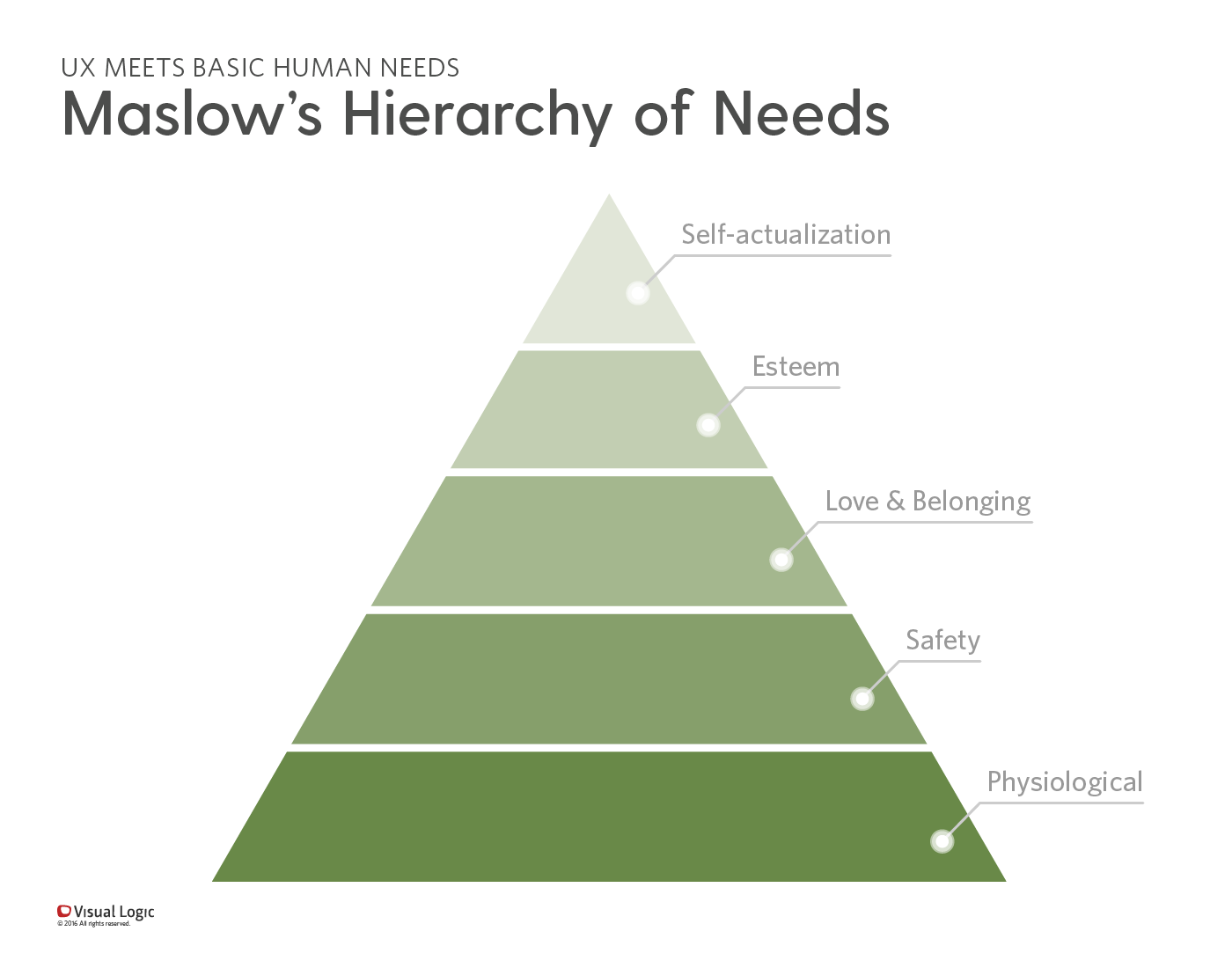
 Safety is near the base of Maslow’s Hierarchy of Needs. It’s been accepted as the second-most important human need, just after physiological needs such as food, water, and shelter.
What happens when safety is neglected in UX design?
There are fewer risks associated with experiences like games, productivity tools, and websites, but safety should still be a checkpoint when designing these products. While its hype may have died down a bit since its initial release, new research shows that Pokémon GO, a mobile game, possesses many real safety concerns.
The premise of the game is that players (Pokémon trainers) must catch Pokémon characters by traveling to different locations using location-based technology. Because this game requires players to visit various locations, there has been some concern with the game distracting players from what should be primary focuses, like driving. Another issue has been that the game may lead players being into to dangerous environments to find Pokémon. One recent incident occurred in Central Park; a video has surfaced showing the mugging of a Pokémon GO player. A new Twitter study found that, in a span of just 10 days, 14 vehicle accidents were reported. Many tweets have surfaced explaining how people are dangerously playing the game.
There was a 'Forbidden' error fetching URL: 'https://twitter.com/BA_AlyssaNicole/status/752261798406086656'
There was a 'Not Found' error fetching URL: 'https://twitter.com/Amy9853/status/768607118819790848'
dad: "some 34 year old man fell off a cliff because of pokemon go"
— 𝐞𝐫𝐢𝐜𝐚 (@ericaparkerr) August 26, 2016
my little brother: "yeah there is water pokemon" ...
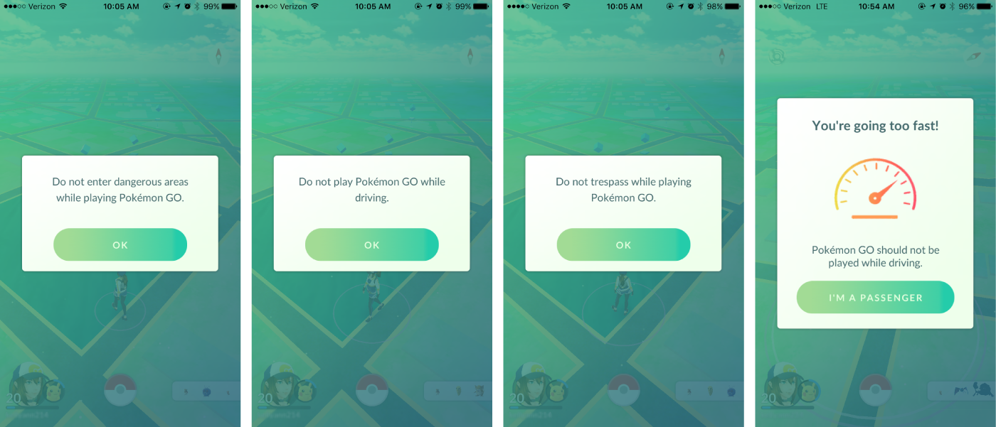
Niantic, the company that developed the game, has made a few strides to warn players of the game to always be aware of their surroundings, to not drive while playing, and to not enter dangerous areas.

While these warnings are helpful, they may not be enough. Some users completely disregard them or find humor in mocking the warnings. Here are some real user responses to some of these warnings:
How many times do I have to tell #PokemonGo I'm not driving before it realizes I'm lying?
— Eddie Mauldin (@eddiemauldin) September 8, 2016
Do not play Pokemon Go while driving? That sounds like a dare...
— Marty 🌵 📚 (@aclaritymaven) September 8, 2016
What does this mean for your responsibility to your customers?
It’s the product owner’s responsibility to provide a safe user experience. To have your customers’ best interests in mind means taking safety so seriously that you go beyond providing warnings; you design a solution to steer the user away from risky behavior. In the case of Pokémon GO, why display a warning to avoid entering dangerous areas when you can eliminate Pokémon from appearing near cliffs or rivers? Why warn about not playing while driving when you can prohibit the location-based game from functioning when traveling at a certain speed? We can put warnings up, but a good UX practitioner will eradicate the need for those warnings whenever possible.
In recent years, using phones while driving has increasingly been an issue and a cause of many accidents. Drivers today are used to having GPS directions on demand or the ability to call while driving. Any use of mobile devices while driving, even with hands-free technology, is distracting. There are some great organizations out there advocating for users to turn their phones off in the car, and this awareness is gaining traction. Unfortunately, these dangerous habits have already been established. It’s not up to the automakers to change drivers’ habits but rather, to solve for the new problems those habits have introduced (as long as it’s not at the cost of their safety). This is probably why, rather than just placing warnings in vehicles to not use mobile devices, we’ve seen an increase in vehicles with bluetooth, hands-free, and eyes-free technology, allowing drivers to utilize features like GPS directions while keeping their hands on the wheel and their eyes on the road.
No matter your industry, the experiences you are delivering should be trustworthy and should keep your customers’ safety in mind. It can be difficult to find the balance between designing for the habits of your users and creating a safe experience. But, ultimately, your customers’ absolute best interests are your top priority, and staying safe is in everyone’s best interest.


