Project #GiveBack: A Look Inside the Website Redesign of Self-Help International
8 min read
When you hear “mission trip”, what’s the first thing that comes to mind? Perhaps you think of traveling with your church, painting houses and planting food for those in need. Maybe you think of traveling to unfamiliar places, helping teachers with students, or caring for children. These are all things to be proud of—but recently, I learned of an entirely new approach: don’t do it for them, teach them to do it themselves.
“Self Help International (SHI) devotes its efforts to alleviating world hunger and poverty by providing opportunities to rural citizens that ultimately lead to self-reliance. Since its inception, Self-Help has served as a vessel; training, education, and opportunities are provided to rural citizens and whole communities in developing countries so that they can have better lives.”
Long story short: SHI helps people help themselves, because the greatest asset of any nation is its human resources. Originating in 1959, and later forming a partnership with Nobel Peace Prize Laureate Dr. Norman Borlaug, SHI has been able to make significant improvements within Ghanaian and Nicaraguan communities by providing sustainable solutions for agriculture, education, clean water, and entrepreneurship. With this kind of impact, you may be asking yourself the same question I did prior to this project: Why have I never heard of this organization? Furthermore, they are headquartered in Waverly, Iowa—which is 30 minutes from my current location. It quickly became clear that something needed to be done to help spread the word about this organization.
In Ghana, 1 in 4 children under the age of five is stunted due to malnutrition. In Nicaragua, 60% of children have to be treated every week due to unclean drinking water. Farmers are limiting their yield production because of preventable mistakes, and women aren’t able to reach their full potential to support their families.
With figures like this, it takes dedicated, caring, and passionate people to spread the word and ask for help for those voices that can’t be heard. Luckily for them, Self Help International is on their side—so we decided to help.
During our first meeting with the SHI team, we learned that their donor base is dwindling. There was no hesitation when they told us one of the biggest reasons for this: the website. With little-to-no resources or expertise to dedicate toward website and marketing materials, SHI has not been able to reach the people most willing and able to help—the GenX and Millennial generations. They reach current donors through e-mail and paper newsletters, but they know in order to grow their support, they’ll need something much better than their current website. And here’s why:
Unhelpful Homepage
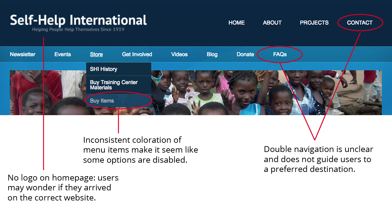

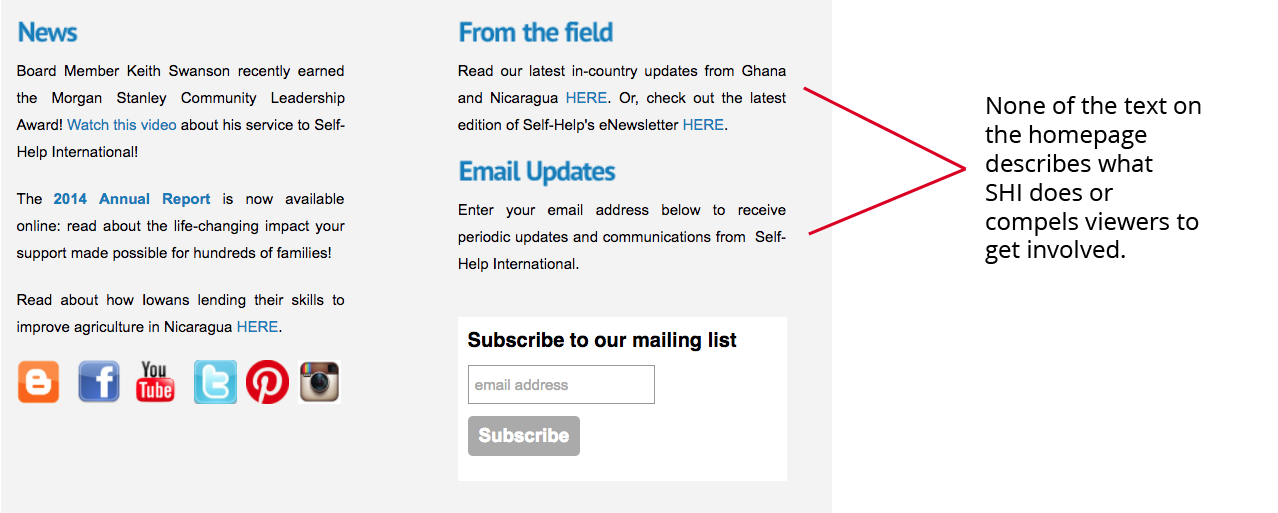 The homepage is the first thing people see when coming to your site. It should immediately show a clear mission or description of organization, why viewers should get involved, and how to get involved.
Inconsistency and Disorganization
Across the site, there are many elements that vary in both look and behavior on each page. Examples include variations in the navigation, extra footers, broken links, and irrelevant page information. Research shows that users will form an opinion of a website in 50 milliseconds—that’s 0.05 seconds. Additionally, there is a 50% decline in likelihood that a new user will successfully execute a task on a website if their first click is the wrong click. If a website doesn’t work or doesn’t make sense to viewers, they are likely to leave it immediately. Below are a few things that may have caused user confusion or frustration on this website:
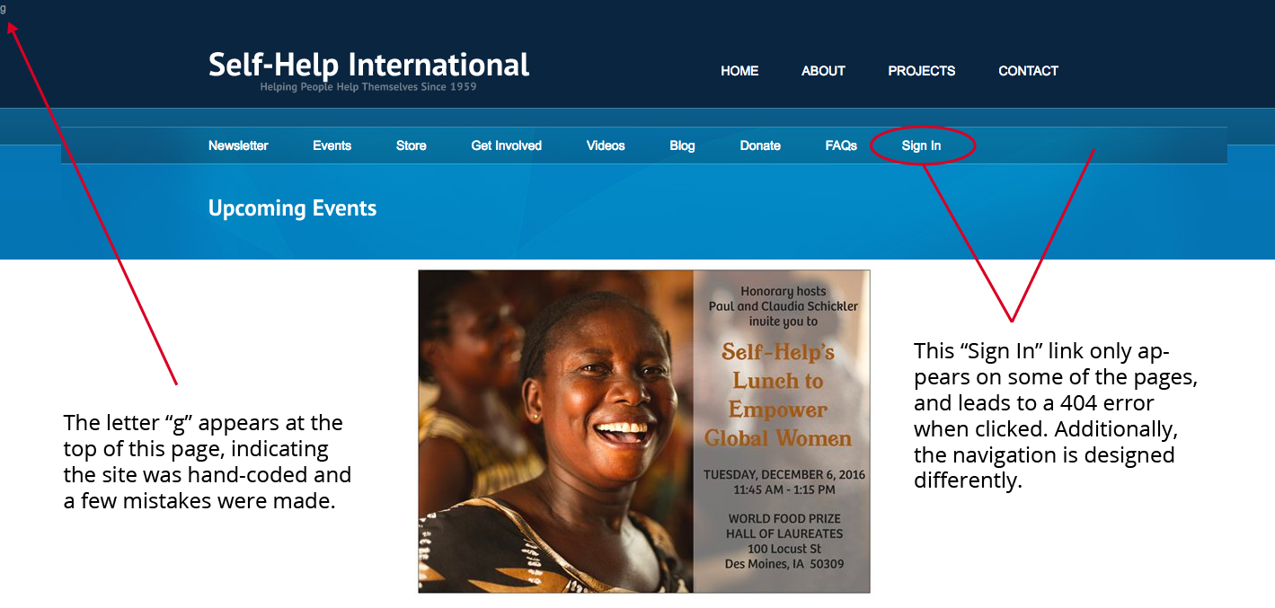 The remaining information on this “Events” page only includes one event, otherwise it contains a donation form and a series of sponsor thank-you’s. It’s clear how this could easily result in a frustrating user experience for viewers trying to find information about an upcoming mission trip or fundraiser.
Unsustainability
For an organization like SHI, the current implementation of the website is not sustainable, as any changes would require experience in web coding. Since SHI is a small organization, it would be much more useful and efficient to implement a server-side content management system (such as Wordpress) to abstract away all coding concepts, give a scalable structure to the site, and allow for SHI employees to easily understand and add content to the site. Additionally, content management systems typically optimize images, allowing pages to load in a timely manner and scale correctly to the site. SHI wants to focus their time and effort to the communities they’re helping—and we want to help them do that.
ENTER VISUAL LOGIC
A happenstantial meeting between myself and a Self-Help International employee led to the opportunity for Visual Logic to volunteer time to redesign and build them a new website—and we couldn’t be more thrilled. Mainly because they do amazing work; each program makes so much sense and is thoughtfully carried out. And also because they are saving lives, and we want the world to know about it.
Don’t just take our word for it, see for yourself. Below are some things SHI has accomplished:
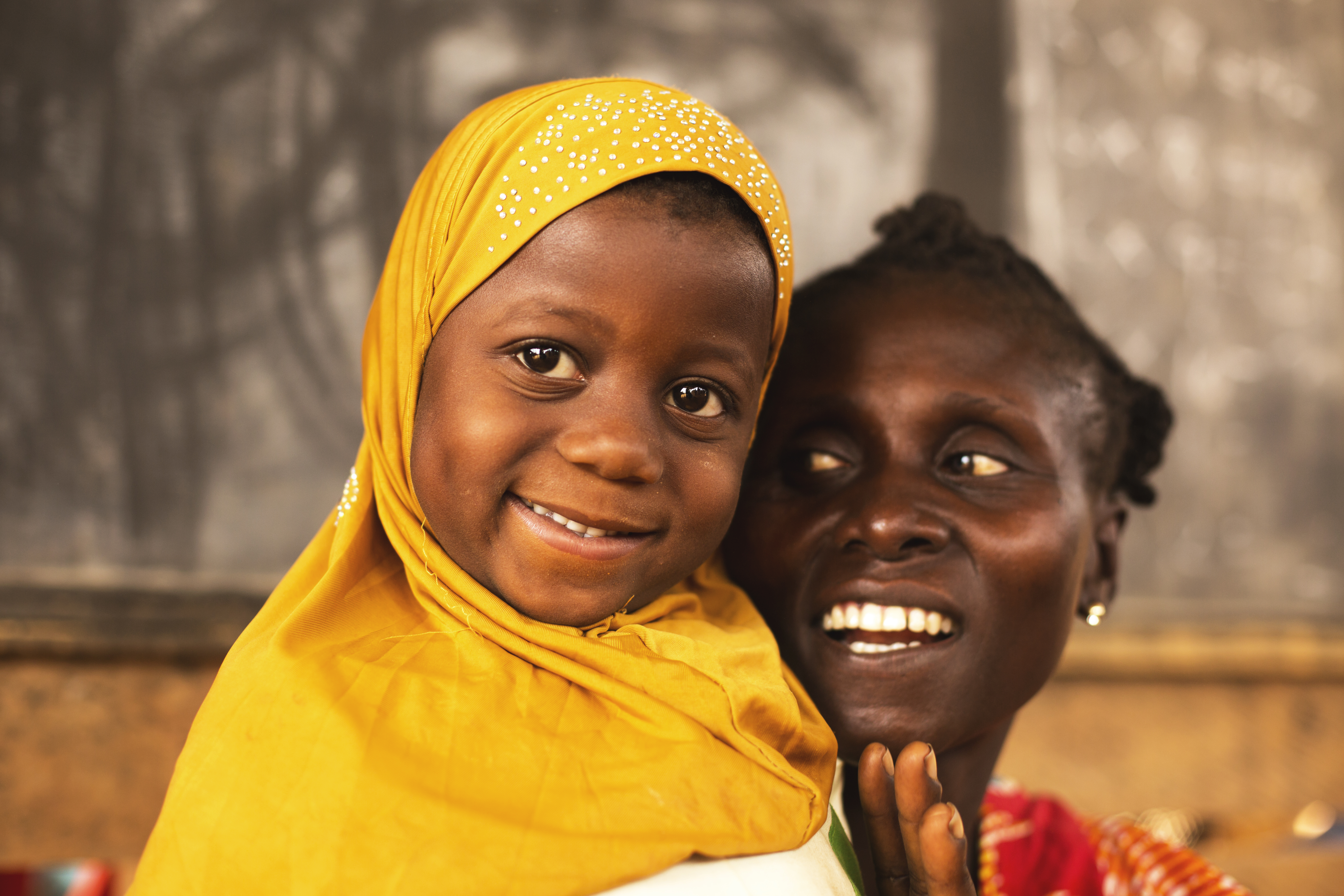 Each year, up to 300 Nicaraguan children die from completely preventable waterborne diseases. Through their clean water program, SHI has provided clean water for more than 65,000 people. Not only do they provide it, they train local leaders to maintain the water systems within their community– creating jobs, leadership, community engagement, and sustainability for years to come.
In 2013, SHI created the Fred Strohbehn Training Center in the southern region of Nicaragua. A demonstration plot was constructed around the space allowing locals to learn how to grow corn to produce higher yields, teach women how to bake using efficient, environmentally-friendly ovens, and present how testing is done to provide clean water using a chlorination system.
In the 2013-2014 season, more than 1,500 farmers planted certified seed corn through the Center’s agriculture program. In 2016, due to demand, the Center began offering monthly informational sessions about their programs. Since May this year, the Center is now averaging about 26-45 farmers, women, and children per month.
In addition to children in Ghana being stunted due to malnutrition, nearly 1 in 3 children among the rural communities is chronically undernourished. SHI’s school feeding program provides children with a free protein-rich daily breakfast porridge called “koko,” which is made from quality protein maize (QPM), sugar, water, and other nutritional supplements (when available).
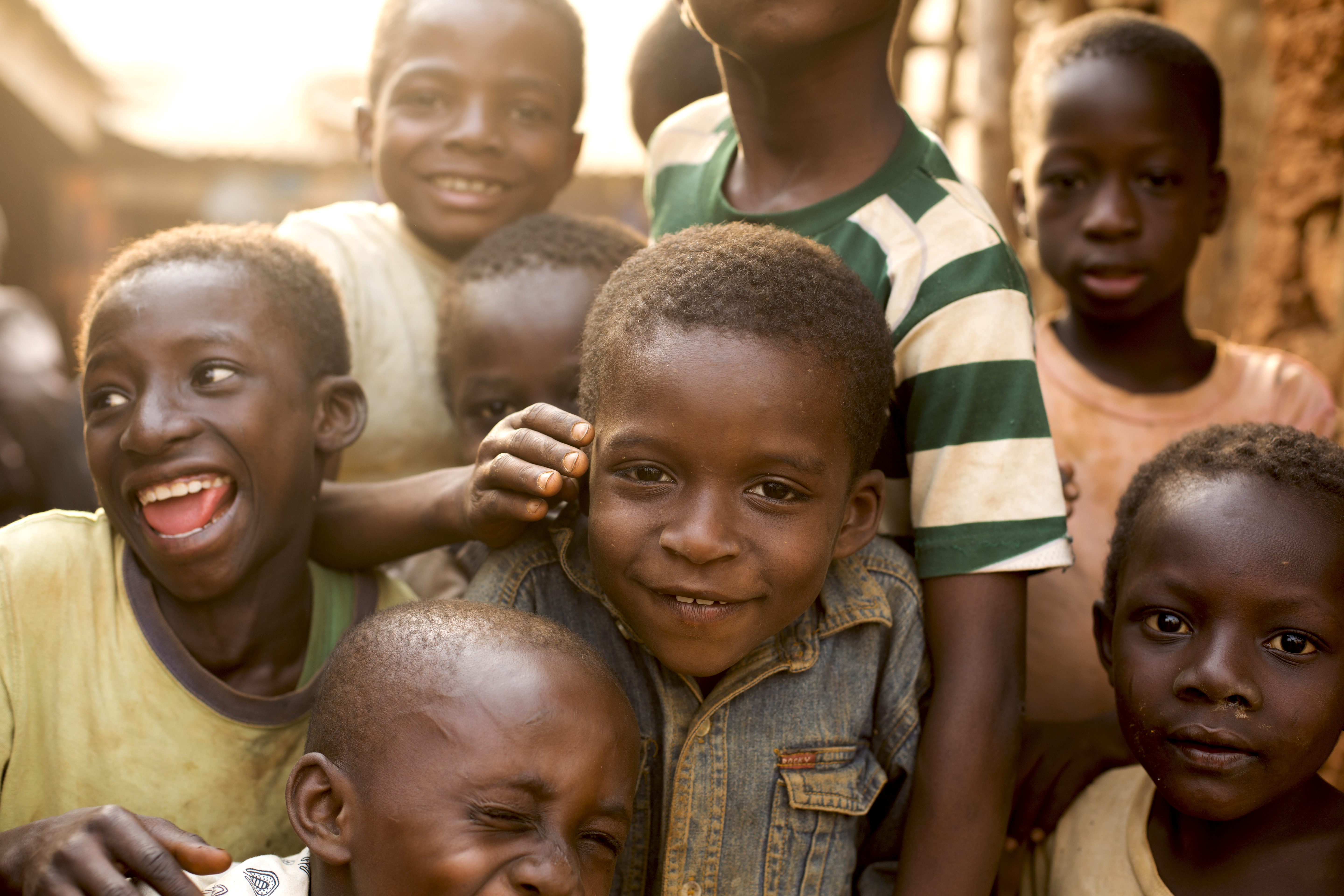 Self-Help International’s water program ensured 461 more children in five communities ate a healthy daily breakfast through the school feeding program in 2016.
Women reinvest 90% of income into the family, ensuring that their children are well-fed, clothed, sheltered, and able to get the education they need to break free from the cycle of poverty. SHI trains women in basic business skills and offers micro-loans so they can start up small businesses, generate a steady source of income, and better provide for their families.
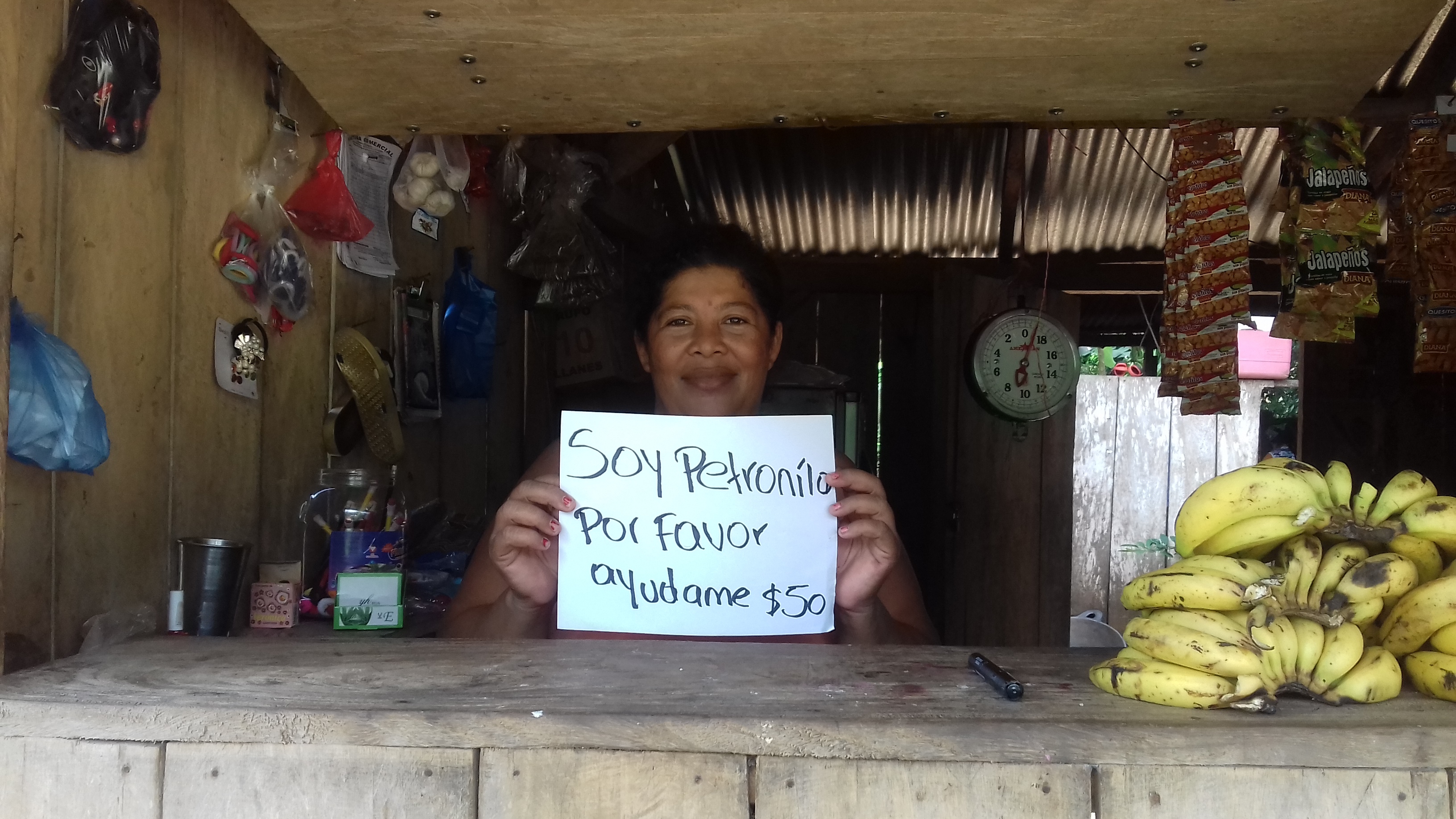 In 2015, 412 women were empowered to take control of their financial futures. 56 of them were first-time loan recipients. 171 women attended training sessions on improved financial management and business practices, such as how to determine business income, expense and profit, how to make personal savings for future expenses, and the benefits of reinvesting profits into businesses. In 2016, the number of women empowered through training and micro-loans to increase income and better meet their families’ needs rose to 584.
As an organization doing that many great things, it’s a shame their website hasn’t been able to show it. SHI has inspired us as a company, and we hope their new website inspires you. During the first two and a half days of Thanksgiving week, we put aside all other work and gathered together to design and build a new website for Self-Help International. Take a look at our process:
 Phase 1: Divide and Conquer
 Phase 2: Propose Three Designs
 Phase 3: Build It Out
After a very busy few days, we’re extremely happy with how the website turned out. We’re confident that a clear message, powerful stories, and unambiguous calls to action will drive people to get involved, and help SHI reach the younger generations that will be supporting these communities in the future.
Take a look at the final result:
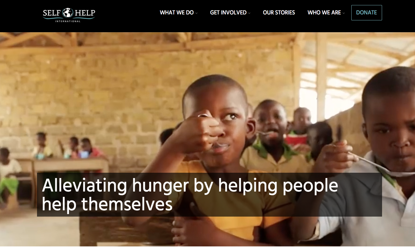 Clear, powerful message on the homepage with a simple navigation and a prominent call to action
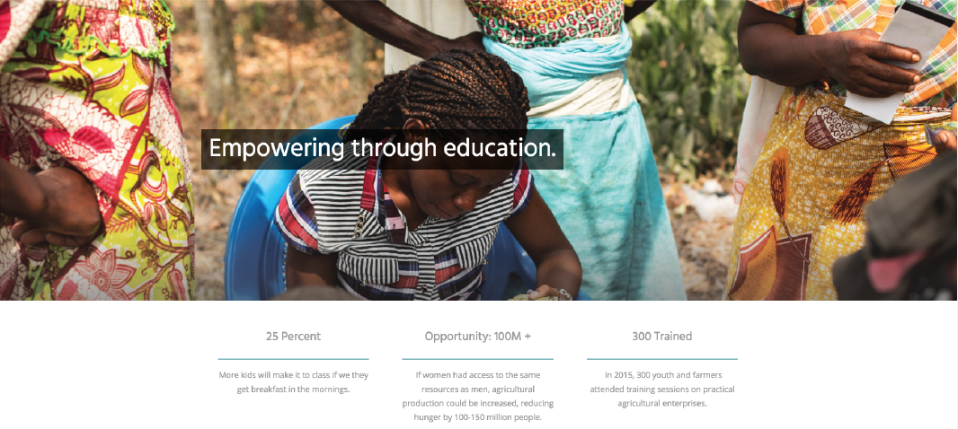 Descriptions of each program on the homepage, along with statements to motivate viewers.
 Navigation is simple and consistent, easily guiding viewers where they need to go.
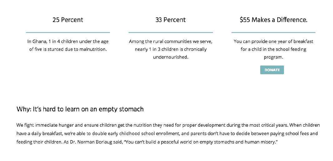 Content on each program page is descriptive and persuasive. It gives people a reason to get involved.
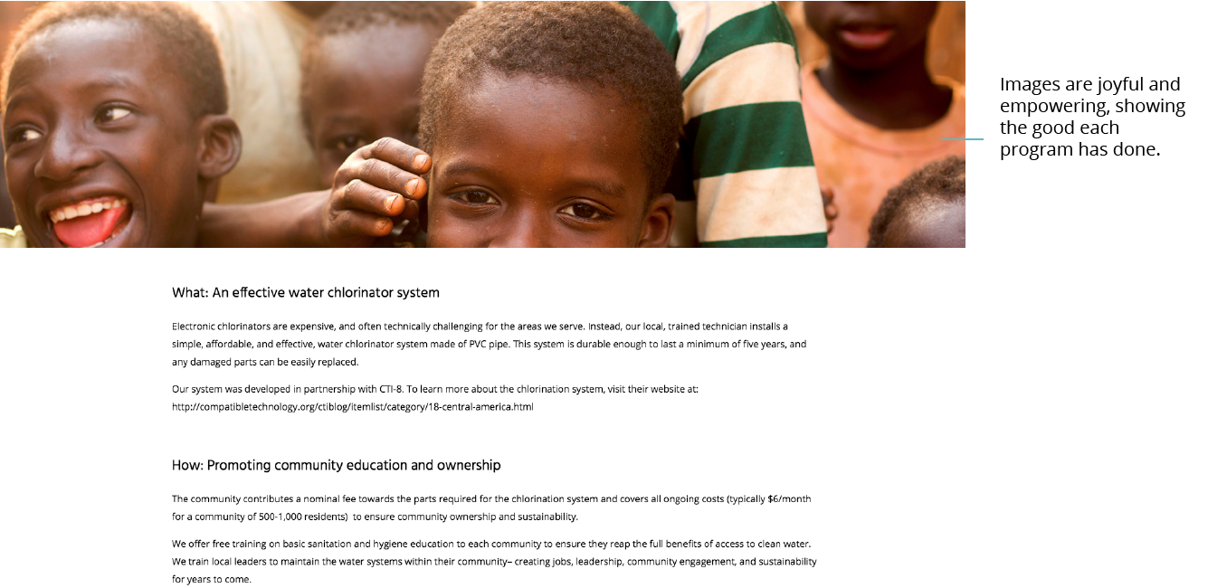 Images are joyful and empowering, showing the good each program had done. Related information is condensed and easily understood.
Visit selfhelpinternational.org today to learn more and get involved with this incredible organization.
 “Give a man a fish, and you feed him for a day. Teach a man to fish, and you feed him for a lifetime.”


