How human-centered designers prevent Frankenstein’s creature
12 min read
Leaves were falling. The days had noticeably shortened. A warm summer sun was replaced with a cool fall breeze.
Mary and Henry sat in a dimly lit office beside a retired barn door converted into a conference table. Red whiteboard scribbles hovered above the table’s epoxy finish.
Dissonant beeps broke the silence as Mary dialed into a remote meeting. Henry’s laptop was open—prepared to document as much of the upcoming conversation as his typing-speed would allow. A whiteboard marker stood ready to illustrate concepts.
An almost human, female voice answered, “Welcome to…” an awkward robot voice interjected “Cadabra Incorporated.” The female voice returned, “You are the first caller. The host has not yet arrived. To mute your line, press star 6; to unmute, press pound 6.
“You will now be placed into the conference.”
Mary gave Henry a blank stare. Neither knew what to expect. They hadn’t heard anything from Cadabra Inc. in two weeks. The deadline was approaching. Mary was relieved that Victor, a trusted contact within Cadabra, was willing to schedule time with her.
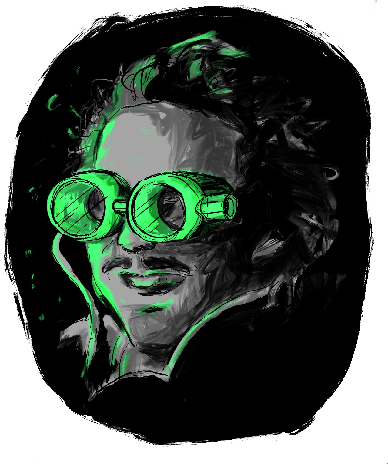
Enter Victor
Victor is passionate and determined to drive change in his industry. No meeting time is off limits. Anything to help move his ambitions forward.
Victor naturally understood his users. His family relied on Cadabra innovations over the course of three generations. He was raised using Cadabra products and had a strong emotional tie to the brand.
Victor thoroughly understood the problem Cadabra solved and intimately related to his users. His friends and existing family members still use Cadabra products and jokingly remind him of Cadabra’s shortcomings.
Over time, Victor’s passion and drive elevated him to a point of leadership. His mid-sized, talented team respected him and trusted his direction. His work ethic set the pace of progress.
Despite his passion, Victor wasn’t perfect. Not all his new ideas—product features or otherwise—were welcomed with open arms. He had his fair share of successes and flops.
Victor’s DIY human-centered initiative
In the rise of consumer technology and social media, Victor began to hear the terms “user-friendly”, “easy to use”, “user experience”, and “human-centered design” used more often in strategy meetings.
He also witnessed new companies grow tremendously heralding human-centered design (HCD) to produce a fantastic customer experience. Unfortunately, some of those companies were beginning to compete for his customer base—and doing so with nascent success.
Victor dove in. He decided to embrace HCD methods to achieve his project goals. He worked hard to understand the processes and benefits of a well-thought user experience.
Though Victor couldn’t articulate his product’s usability faux pas, he knew they existed. His products didn’t compare to the design standard that consumer products embody. A standard his customer base now expects from his products.
Victor began forcing human-centered design tactics into his team’s process. He first revisited and reestablished the three forgotten personas. Each new feature was to be viewed through a persona’s lens, which included their emotional state, location, time of day, weather environment, hardware device, attention span – considerations long forgotten by his team.
He forced his team to create wireframes before developing each user story. Each wireframe had to be signed off by Victor before moving forward. Additionally, he asked his team to put the feature in context and explain how the feature fit into the persona’s day, week, and month.
Unfortunately, his human-centered initiative backfired.
Victor’s team entertained his plan, but soon grew increasingly frustrated by the added friction and slow pace. Furthermore, no one seemed to have an affinity for the process.
As a result, the promised dividends of increased user satisfaction and customer retainment were never realized.
Frustration climaxed when the team missed a deadline by two weeks. Moreover, the shipped feature contained a debilitating bug that caused the entire application to freeze during a specific workflow.
Three high-paying customers that experienced the bug expressed their anger with a scathing phone call to the support team. Conversations erupted on social media and Cadabra forums. Industry journalists published the public company’s misstep causing a momentary share price dip.
Victor’s HCD mistake went public.
Victor’s first human-centered success story
Despite this setback, Victor doubled-down. He took a risk.
He understood time was of the essence in the fast-paced technology world and needed to jump-start his HCD initiative with new fuel.
He reached out to several vendors who specialize in human-centered design. After a vetting process, Victor decided Henry and Mary’s team provided the right combination of experience, skill, and culture.
Victor was apprehensive the first month as he educated Mary and Henry about Cadabra’s mission, customers’ pains, and Victor’s own vision.
Victor doubted that Mary and Henry could traverse the steep learning curve within Cadabra’s domain. His doubt has been reinforced by many consultants who failed to learn fast enough and generate the desired value he paid for.
Despite his doubt, Mary and Henry collaborated differently and asked more and different questions. After four weeks, his outlook shifted as he witnessed the impact of the human-centered methodology and the creative thinking that followed.
Mary and Henry caught traction and generated exciting concepts for Victor’s vision. Concepts that were not only forward thinking but matched the mental models of Cadabra’s users.
Over the next few months, Mary and Henry’s team reshaped Victor’s product—placing empathy for each persona at the center of each decision. Concrete principles drove the design. This collaboration de-mystified the previously “magical” human-centered design process.
With Mary and Henry’s help, Victor’s human-centered design endeavor felt achievable for the first time.
Mary and Henry presented a perspective Victor hadn’t considered with an entirely new paradigm to explore. Naturally, the concepts were far from flawless, but Victor filled in knowledge gaps and curbed overly ambitious concepts to move the project along.
Victor felt a renewed sense of excitement and confidence—a refreshing feeling to have back.
The detrimental designer
A chime came from the Polycom, “Hello! This is Victor.”
“Hi Victor, how are you?” Mary responded.
“Great, thanks. Did you receive my presentation?”
“Uuuuh, not yet… Wait! It just arrived.” Mary scrambled to download it and find it in her downloads folder filled with previous documents from Victor.
“Okay, we’re going to discuss slide 9.” Victor declared in his paradoxically friendly, yet authoritative tone of voice.
Slide 9 displayed a screenshot of the most common interface in Cadabra’s flagship product. Mary and Henry were familiar with the screen. They designed it a few months ago.
Victor’s redesign attempt rested at the crossroads of his vision and the new project requirements.
Mary and Henry huddled around the monitor looking at the slide while listening to Victor describe the goal and new requirements. He acknowledged the limitations of his understanding and the limited timeframe.
Victor held Mary and Henry to high expectations and pushed them to deliver results quickly, however, he was also empathetic to twists in the road. This was a twist in the road.
Victor’s top priority was to deliver results for the near-term goal of a stakeholder pitch and customer presentation. Mary and Henry felt apprehensive about an “immediate win” if it meant long-term headaches. They have ample experience to know the ramifications hasty decisions have—some mistakes costing ten times more than doing it right the first time.
“Okay, here is what we need to do based on some new requirements.” Victor began as he elaborated on his design solution. “First of all, what we currently have is fine; I made some adjustments for this initial meeting.”
The screen of interest is complex due to Cadabra’s rigid requirements. Mary, Henry, and an entire team performed information architecture, interaction design, and interface design wizardry to gracefully piece the puzzle together.
Creating Frankenstein’s creature
As Victor described the changes, additions, and deletions, Henry leaned closer to study the screen.
Victor confessed to altering the design using an assortment of components and styles from previous design iterations and tools from third-party acquisitions. Furthermore, the development team independently hand-picked two different component libraries to accommodate the new requirements.
“Ok, what you see is already being built. This is what will be shown next month.” Victor proclaimed confidently.
Victor’s modified design disregarded the established human-centered principles, content hierarchy, and design consistency. Moreover, the new mockup optimized for a user model significantly different than the previously established research illuminated.
Henry and Mary’s original solution was accomplished through hundreds of subtle design maneuvers (and trial-and-error) that delicately balanced user-needs with the strict requirements.
Unfortunately, Victor’s version didn’t take the interdependent design system into consideration. Soloed solutions driven by short-term demands perniciously undermine the system as a whole.
Entire components were wrongfully placed in the screen framework. High-level information now shared space with low-level details.
The four libraries of components clashed with the established component set.
A lack of spacing caused claustrophobia.
The secondary call-to-action button doubled in size and competed with the primary call-to-action’s dominance.
A lack of type hierarchy caused confusion. Headings were nonexistent or styled the same as the body text. The body text devolved to a crowded, unreadable state.
New colors were introduced. Existing colors were mistakenly changed. Key colors were absent.
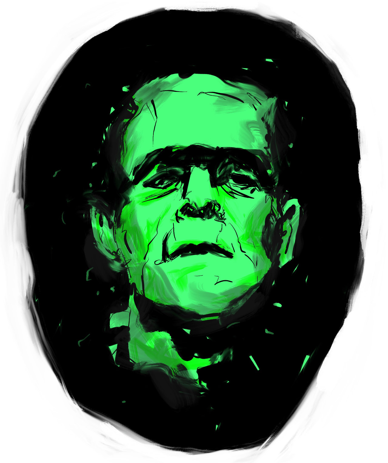
At last, a Frankenstein creature was born.
Mary and Henry paused.
After gathering herself Mary responded, “Victor, we notice some changes we can make—both large and small—that will significantly improve the usability. We will design two solutions: quick-wins and larger changes. We’ll also articulate why those are an improvement and the trade-offs of each. We will get those to you be the end of the day today. Is that okay?”
“Yeah, that’ll work. So long as it doesn’t impede on your design system progress.” Victor agreed.
Victor isn’t a designer and that’s ok.
In Victor’s defense, his redesign effort was a hard task destined for embarrassment. It’s not Victor’s job to be a designer. His main objective is to move forward amidst turmoil—not focus on design details.
Victor lacked the experience, tools, and time to rightfully bake in the new requirements tactfully—especially given the system’s uncompromising complexity.
The task was a challenge for an experienced human-centered designer—more so for a time-constrained product owner.
In the absence of designers, Victor Frankenstein incrementally dilutes the product with a thousand concessions.
Often, these Frankenstein moments occur because legacy processes, rushed time frames, vague understanding of HCD principles, and siloed solutions don’t align with the long term strategy, holistic system, and company’s mission.
Promises from the sales teams to customers and promises from executives to shareholders also adds stress on Victor to deliver something impressive and profitable.
Undisciplined curation of user needs makes it hard for Victor to fix his sight on the biggest customer impact at the lowest cost to his team.
Furthermore, unestablished design systems leave room for interface inconsistencies and design elements used incorrectly. This bloats the number of design components and adds confusion to each components’ rules. This also makes onboarding new team members painful and each additional tasks more difficult.
Poise Victor for victory
As a design community, we see these situations happen frequently across companies big and small. We take responsibility for these Frankenstein moments, course correct mistakes, and prevent the monster from seeing the light of day.
Human-centered designers should collaborate often, communicate principles clearly, articulate design solutions succinctly, and check-in regularly to mitigate this risk.
As human-centered thinking saturates a culture, the birth of Frankenstein agglomerations decline and user satisfaction rises. This is more than a process change, it’s a culture change. Naturally, this transition takes time and effort.
As a design team establishes, maintains, and educates a culture on a design system and the underlying design principles fewer Frankenstein solutions are generated and the cost of usability declines. Though a thoughtful design system doesn’t eliminate the need for designers, it can hedge again usability blunders.
Some Frankenstein moments are the result of pragmatic constraints outside of an HCD team’s control. Despite this challenge, it’s Victor’s responsibility to weigh the usability trade-offs that short-term pragmatism demands. Human-centered designers help Victor articulate usability trade-offs and consider alternate solutions to mitigate usability mistakes.
Human-centered designers augment Victor’s vision.
Designers who relentlessly advocate for the holistic customer experience are important sidekicks to Victor and his vision in the following ways:
- Human-centered designers help Victor bake HCD practices and principles into his current process. Without a human-centered approach, this process change is fraught with confusion, frustration, and turmoil.
- Human-centered designers see Victor’s vision from a fresh perspective that yields unexpected solutions rooted in strategy, customer delight, and business growth.
- Human-centered designers can evoke a renewed zest and confidence in Victor and his team by delivering exciting designs to exceed customers’ expectations.
- Human-centered designers help Victor weigh short-term usability trade-offs and design the best solution within the constraints.
- The human-centered process mitigates Victor’s risk of shipping siloed, inconsistent designs. These Frankenstein monsters damage the company’s brand and Victor’s reputation.
- Human-centered designers are more apt to think strategically and respect how the current product fits into the company’s mission as a whole.
- Human-centered designers articulate design solutions and underlying principles to Victor and his team. Over time, this design thinking bakes into the culture, which then yields a repeatable, high design standard while lowering the cost of usability.
Human-centered designers help equip Victor to not only avoid the monster’s creation but propel the company forward by focusing on human-centered design.
Is your team’s Victor poised for human-centered design victory?

